In this Excel Pivot Tables tutorial, you will learn how to create a Pivot Table in Excel and perform some essential Pivot Table skills to analyse and report on your data.
The file used in this Pivot Table tutorial can be downloaded to follow along.
Excel Pivot Tables are a powerful reporting tool that allow you to easily organise and summarise a large list of data. They can make analysing even the most complex list of data like a walk in the park.
At first they can seem quite daunting, but fear not, because once you have created your first one you will see that they are very easy to use.
Watch the Video
Create a Pivot Table
The sample data that we will be using in this Excel Pivot Table tutorial is sales data. In the image below, you can see that we have columns for the date, sales rep, region, product category and the sales value.
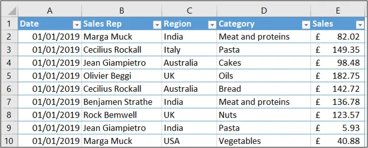
This data is formatted as a table, named Sales. It is always recommended (although not necessary) to create Pivot Tables from data formatted as a table, rather than a range.
There are many benefits to working with tables.
To create a Pivot Table:
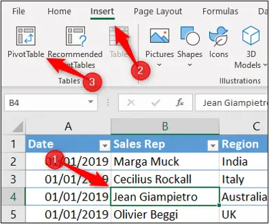
Click a cell within the Pivot Table and click Insert > PivotTable.
The Create PivotTable window prompts you for the data to use, and where to place the PivotTable.
It has automatically picked up the Sales table as the data source.
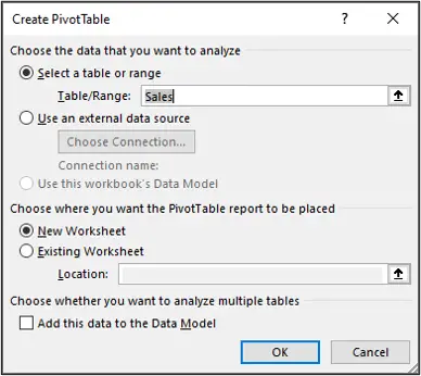
By default, a new worksheet is selected as the destination for the PivotTable. We will keep this, but note that you can use an existing worksheet.
There is also an option to add the table to the data model. This is not covered in this guide. To learn more about this, check out our Power Pivot tutorial.
Click Ok.
The PivotTable is added to a new worksheet. The empty PivotTable is shown on the left and the fields list containing the table columns on the right.
There are also two tabs on the Ribbon named PivotTable Analyze and Design (these tab names may be different on your Excel version). There are many useful controls on these Ribbon tabs.
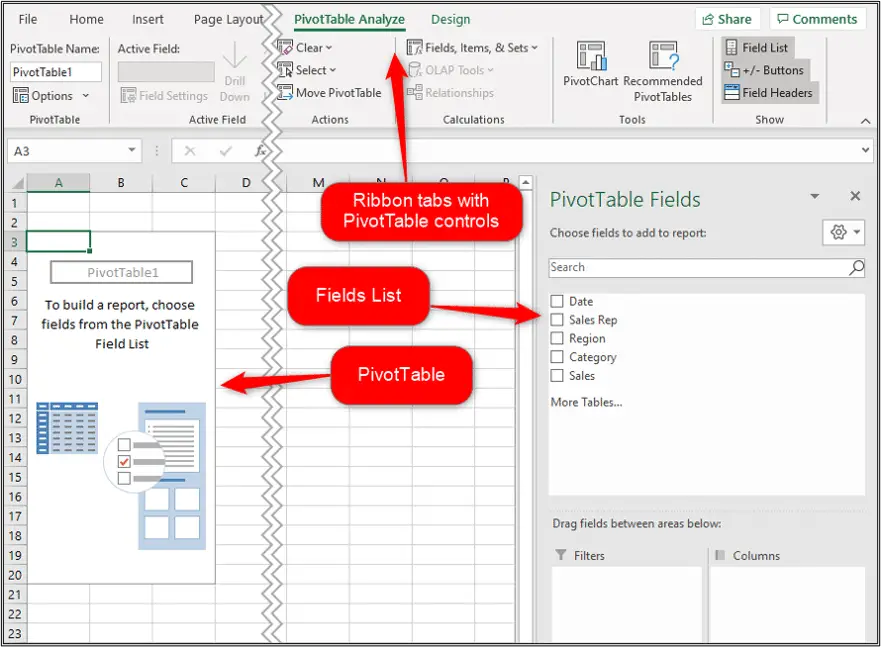
Let us use the fields list to create our first Pivot Table.
We want to know the total sales value for each of the product categories.
In the fields list, check the boxes for the Category and Sales columns. The Category column is moved to the Rows area, and the Sales column to the Values area.
The following PivotTable is produced showing the sales by category.
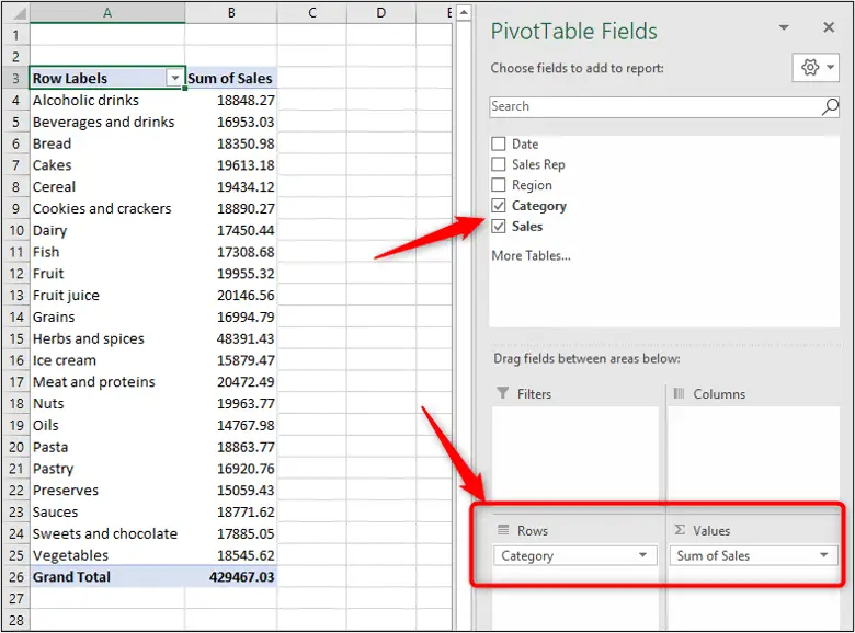
As easy as 1, 2, 3 and you have the results you wanted. PivotTables are amazing!
The Category was moved to the Rows area automatically because it is text. So, the PivotTable assumed we would like to use it as a label. It also sorted the rows in A to Z order.
The Sales column was automatically moved to the Values area. This is because it is a numeric field. The default calculation is sum for numeric fields and count for text fields (Why does my PivotTable count instead of sum?).
As we progress through this Pivot Table tutorial, we will explain how to change the Pivot Table calculation, sort order, formatting and a whole lot more.
Change Pivot Table Calculation
A Pivot Table summarises values using sum by default. However, instead of totals you may wish to know the number of orders taken, or the average amount of those orders.
To change a Pivot Tables calculation:
Right click one of the PivotTable values you want to change, select Summarize Values By and select the other calculation you want to use.
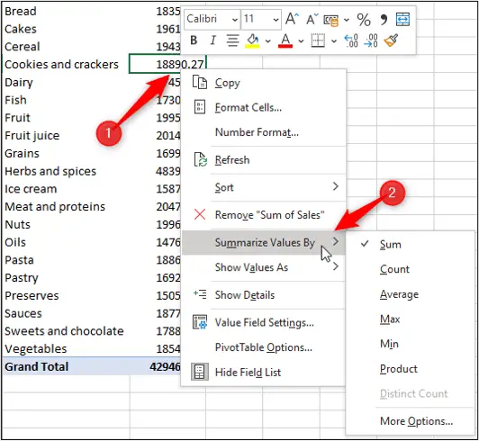
Common calculations such as count and average are easily accessible in this list.
The image below shows the count of sales now applied, instead of sum.
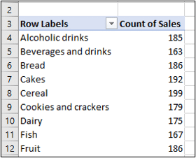
There are 11 different aggregations that PivotTables can perform. Click More Options from the list to see these.
This opens the Value Field Settings window where you see the complete list of calculations.
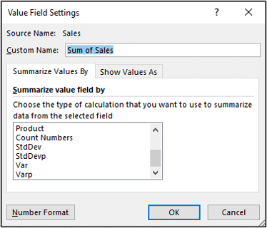
You can also provide a custom name for the column in this window. Something more meaningful than the standard Sum of x or Count of x.
Change Pivot Table Value Formatting
When you first create a Pivot Table, you will probably need to format the values appropriately.
We want to format the total sales values of our Pivot Table into an accounting format.
Right click one of the values you want to format and click Number Format.
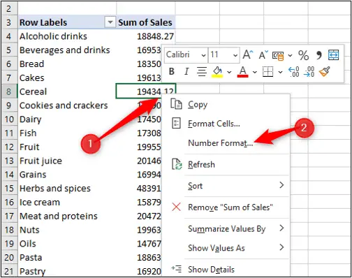
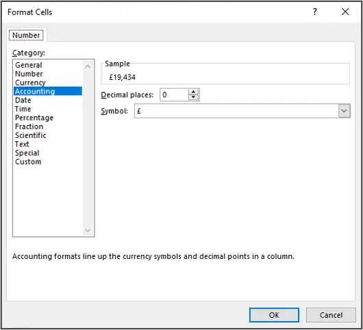
Select the number formatting you want to use.
In this example, I have selected the accounting format, with pounds sterling and zero decimal places.
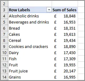
This approach formats all of the values, for that field, in the Pivot Table.
This is because we chose Number Format from the right click menu. If you choose Format Cells, it only formats the selected cells and not all the values for the field.
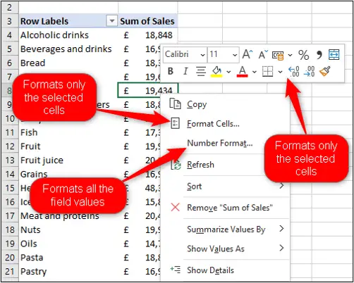
Change Excel Pivot Table Labels and Values
So far, we have only used two fields in our Excel Pivot Table (Category and Sales). But we can use additional fields and also replace the fields of the Pivot Table very easily.
Let’s add the Region field to the Rows area, in addition to the Category field already there.
We will add the field this time by dragging it to the Rows area (previously we checked the box). This gives us greater control over its placement.
Note: If you cannot see the fields list, click a cell in the Pivot Table.
As you click and drag the Region field in the fields list, we can drop it above or below the Category field. Let us drop it above.
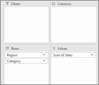
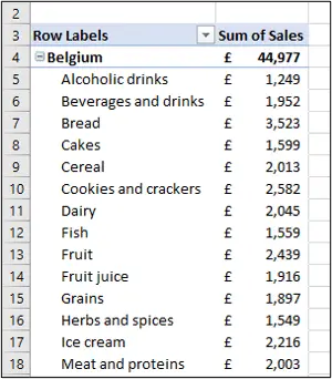
This produces the following PivotTable, with the region first (in A to Z order) and then the category sales within each region.
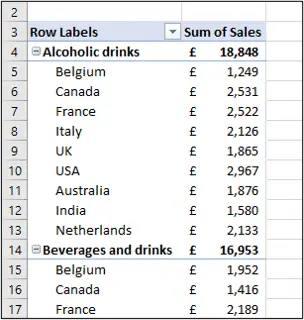
We can change this, and drag the Region field under the Category field in the Rows area, to switch the order that the values are summarised.
We can now see the category sales summarised across the different regions.
There is also a Columns area to display the labels in columns instead of rows. This is great for creating crosstab reports or to compare values side-by-side.
In the example below, the Region field has been moved into the Columns area. The Category field is still in Rows.
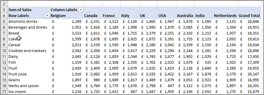
As you can see it’s very easy to adjust the data in a Pivot Table. It’s just a case of moving fields into different areas of the table.
It can take some practice to get more familiar with Excel Pivot Tables. The more you use them, the better you will understand them, and very quickly manipulate data and generate your reports.
Sorting Data in Excel Pivot Tables
We have the following Pivot Table with the Category and then Region fields in the rows.
By default, values are always sorted A to Z by the label. You can see this with both the category and region.
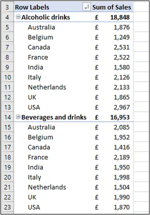
Sorting Pivot Table data is simple.
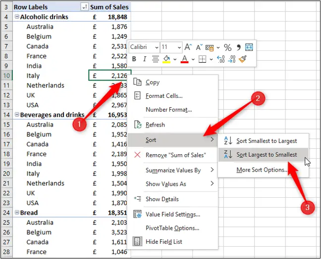
To order the regional sales values from largest to smallest; right click one of the regional sales values, select Sort and then Sort Largest to Smallest.
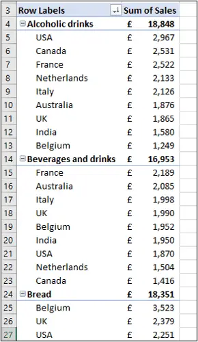
The regions are now ordered largest to smallest by their sales value within each product category. The categories remain in A to Z order.
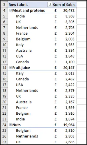
You could also sort the categories by their values largest to smallest by using the same technique.
Right click one of the category total values, select Sort and then Sort Largest to Smallest.
The categories are now in largest to smallest order by their sales total value. And the regions are also still sorted this way.
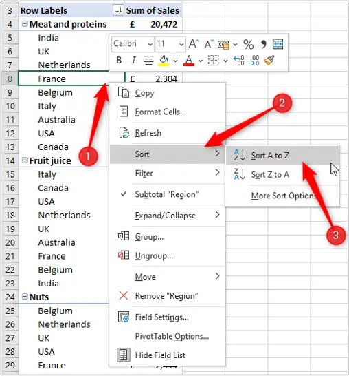
If you wanted to sort either of these fields back in A to Z order by their name. Then right click a category or region name, select Sort and then Sort A to Z.
Filtering Pivot Table Data
Excel Pivot Tables have a report filter area provided. This makes it simple to add fields to act as filters for our Pivot Tables.
Let’s click and drag the Region field out of the Rows area and into the Filters area instead.
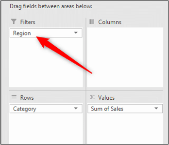
The filter appears above the Pivot Table, by default. So in the image below it is in cell B1.
You can now easily filter the Pivot Table results. In this example, the Pivot Table has been filtered to only shows sales from customers in India.
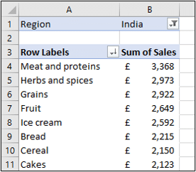
Notice the sales values are still sorted Largest to smallest.
You can add multiple fields to the filter area, just as you can to any area of Excel Pivot Tables.
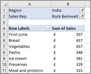
The image below, shows the Sales Rep field added as a filter in addition to the Region field. The Pivot Table now shows results for customers in India where the sales rep was Rock Bemwell.
Group Dates in a Pivot Table
With Excel Pivot Tables, you can group any numeric field. The most common use of this technique is to group dates in a Pivot Table, so let’s look at an example of doing that.
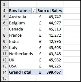
We have the following simple Pivot Table showing sales by region. We would like to see these sales for each month of the year.
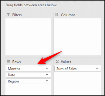
In our data, we have a Date field with the date of each sale. Let’s drag this field into the Rows area above the Region field.
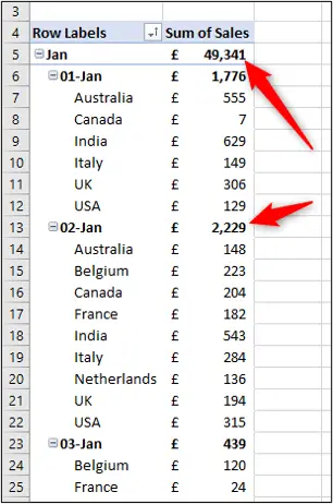
In modern versions of Excel, it automatically groups date fields.
Do not worry if your Excel version does not behave like this, we will look at how to group Pivot Table data shortly.
In this example, the field has been grouped by months and days automatically.
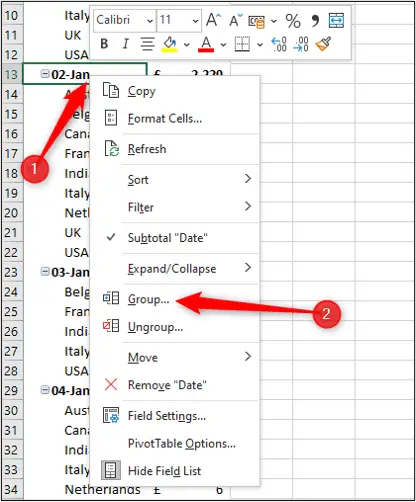
We do not want the sales for days, so let’s change the grouping to remove the day, but keep the month.
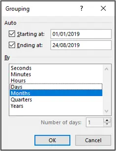
Right click one of the cells that contains a date and click Group (Notice there is also an option to Ungroup).
Click the Days option to remove that group and click Ok.
The Pivot Table now shows sales by month and then region.
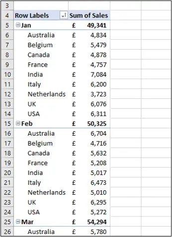
This looks great!
However, when using date and time fields, the Columns area is often a better option.
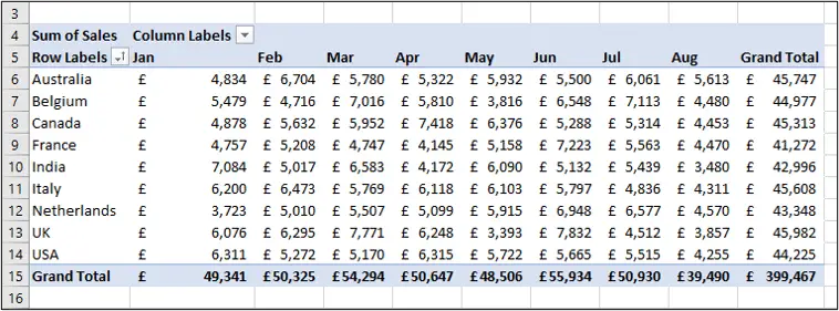
Click and drag the Date field (although grouped by month, it keeps its original field name) from Rows into Columns. You see the following Pivot Table.
Refreshing Excel Pivot Tables
If changes are made to the source data, the Pivot Table needs to be manually refreshed. It does not update automatically.
To refresh a Pivot Table in Excel, click the Refresh button on the Data tab.
Use the list arrow and click Refresh All to update all the Pivot Tables in the workbook.
Closing Words
Excel Pivot Tables are a tool to quickly and easily summarise your data.
They are a representation of your data, so when learning, do not be afraid to play around and see what you can do.
Only by using the tool and you get more familiar with how to use it.
This Pivot Table tutorial is an introduction to the essentials. There is much more they can do.



Hello,
I have just found your website and I must say you are doing an exceptional job with providing these tutorials for people. You explain them in such a way that anyone can understand. Keep up the great work.
Thank you, Lorry.
Great work, two thumbs up.
waiting for next tutorial…
Thank You
Thank you very much.