Create a line graph with a target range to easily visualise values that are achieving a performance expected of them.
The great news is that this is very simple to add to your line graphs, yet extremely effective.
You can read on to see the steps or watch the video of the process.
Watch the Video – Line Graph with Target Range
Create a Line Graph
To start with we have the data below. The colouring of the areas is used just for visual purposes and not necessary for the task at hand.
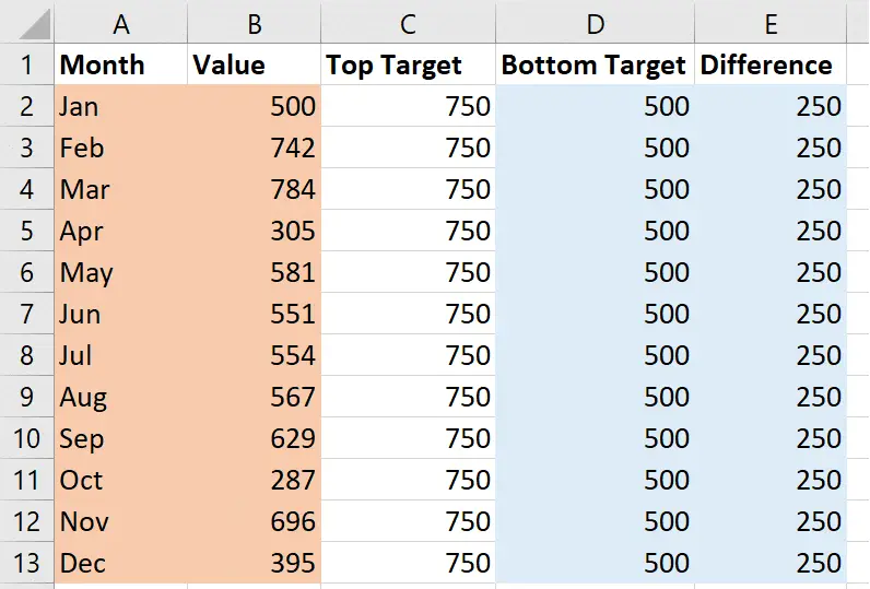
The Month and Value columns will be used as the data for the line graph. The Bottom Target and Difference columns are used for the target area.
The Top Target column is not used at all. It is only used to calculate the Difference (size of the target range) with a simple Top Target – Bottom Target calculation.
Select the two shaded areas by selecting the months and values, then pressing the Ctrl key while you also select the bottom target and difference values.
Insert a basic line graph by clicking the Insert tab and then the Line chart button and the first option in the list.
The result will look like below.
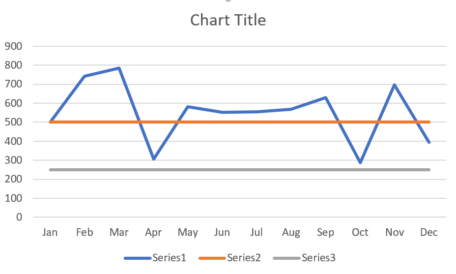
The blue line shows the value, whilst the orange and grey are the bottom target and difference values. This does not look like much a the moment but will take shape shortly.
The Legend shows Series 1, 2 and 3 because I did not select the headers of the data when creating the chart. This is not a problem as I do not plan to use it.
Adding the Target Range to the Chart
Right mouse click on the Orange line (this is not always easy) and select Change Series Chart Type from the menu.
Change the Chart Type for Series 2 and Series 3 from a Line to a Stacked Column.
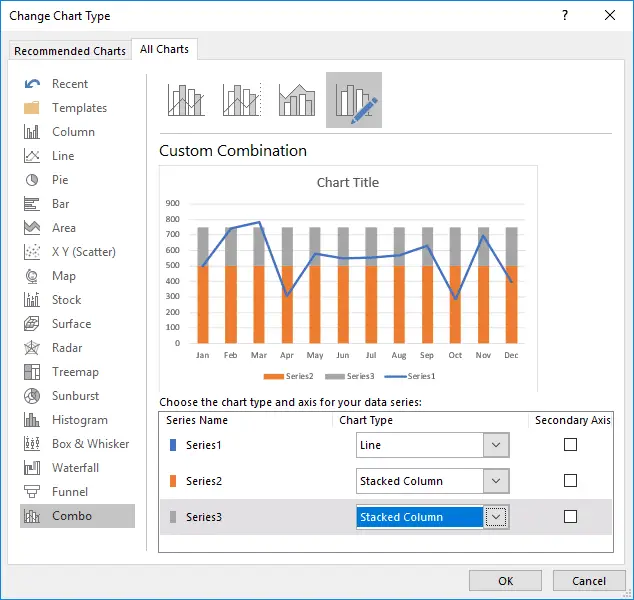
In the preview, you can see that we now have the line graph over 2 stacked columns.
Double click a stacked column on the chart to open the Format Data Series pane on the right (these steps are in Excel 2016, they may appear different).
Change the Gap Width to 0%.
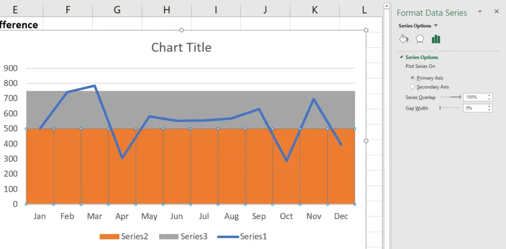
With the orange (bottom target) series selected. Select the Fill & Line category of the Format Data Series pane and select No Fill.
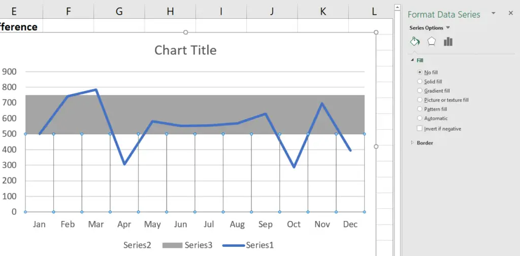
We are now pretty much done. Just some final touch ups to perform.
You can change the fill colour of the target range to something different such as grey.
The Horizontal Gridlines, Legend and maybe even Chart Title can all be removed from the chart.
So it was very simple to add a target range to our line graph, but very effective. It does not always take much to go beyond the standard chart options available.
This chart makes it easy to see that we spent most of the year within the target range. Dipped quite low twice and unfortunately ended the year below it.


Leave a Reply