Create a battery chart in Excel just like you see on your smartphone, tablet device or even PC. It is a great visual way of viewing the percentage remaining of a value.
In Excel, a battery chart could be used to view the amount remaining of a budget, the work remaining on a task, or number of people still to attend training.
There are many reasons why you may want to visualise an amount dropping until it is empty, or complete. A battery chart provides a method that people can relate to easily.
The image below shows a battery chart being used to show the amount outstanding on a training budget.

In this tutorial, we will look at how to create a battery chart in Excel, just like the one above.
Setting Up the Spreadsheet
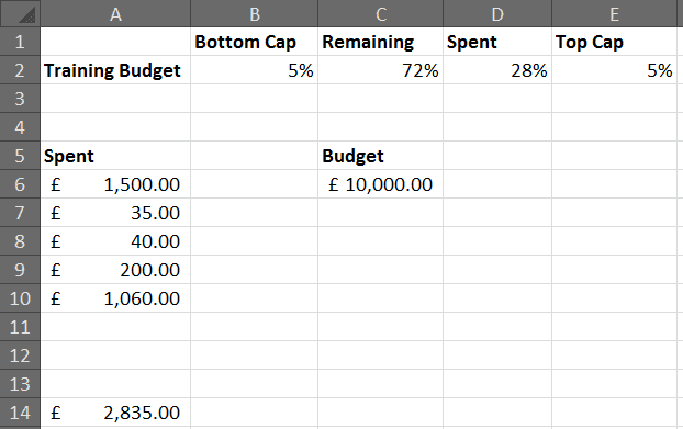
The image below shows the data being used for this training budget battery chart. Here are some things about this setup.
- Cell A14 contains a SUM function totalling the amount spent from A6:A12.
- Cells B2 and E2 both contain 5%. This value will be used to create the top and bottom caps of the battery.
- Cell D2 contains the formula A14/C6. This is the total spent/budget. This cell is formatted as a percentage.
- Cell C2 contains the formula 1-D2. This finds the remaining percentage.
Creating the Battery Chart in Excel
- Select the range of cells you want to use for the chart. In this example that is A1:E2.
- Click the Insert tab on the Ribbon. Then click Column and select the Stacked Cylinder.
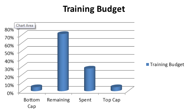
- A separate cylinder is used for each column of our data. Click the Switch Row/Column button on the Design tab to correct this.
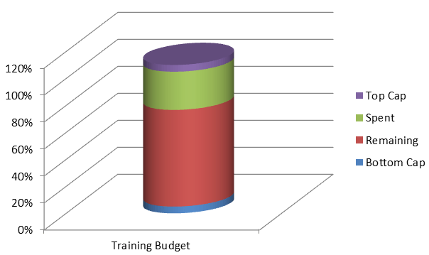
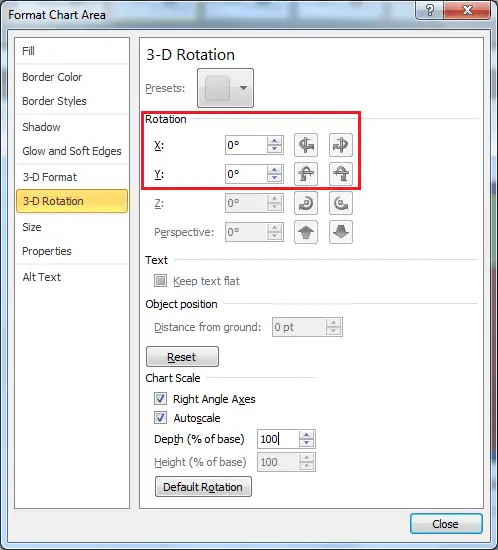
- Remove the 3D rotation by double clicking on the chart area (white space around the outside of the chart), select 3-D Rotation and set the X and Y values to 0.
- Next we will remove all the unwanted chart elements. These include the legend, both axis, gridlines and the floor.
Some of these are awkward to select so use the Chart Elements list of the far left of the Layout tab on the Ribbon. Then press Delete on the keyboard.

- Formatting the battery chart in Excel is next. Double click on each of the four parts of the battery in turn and select Fill, Solid Fill and then a colour of your choice from the options provided.
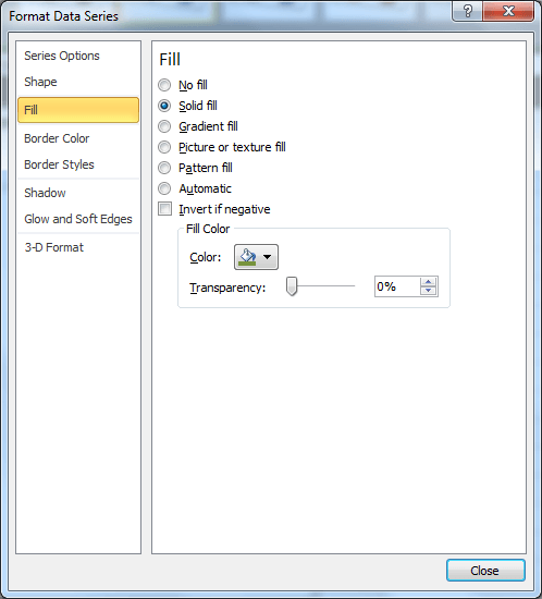
I have opted for dark caps, with a white spent area and a green remaining area similar to what you would find on a smartphone battery.

- The final and optional step is to add a chart title. Click the Layout tab on the Ribbon, Chart Title and then Above Chart. Enter a title and press Enter.
Create a battery chart in Excel in your spreadsheets to track progress. They are easy to understand and look awesome.



Hi Alan
Love your tutorials, many thanks for your tireless effort in educating the general public for free, appreciate it very much.
I have a quick question on this battery chart, the chart works well as long as the actual cost is below the budgeted cost, however when the actual cost exceeds budget is there a way it can be coloured in Red and a remark printed to say “over budget”, if so how can I do this?
Please advise
Thanks & kind regards
Mohideen
Thanks Mohideen. The battery chart will stop at 0. We may have to look towards a bullet chart for this. We would need two data series/columns also. One for on target and one for overbudget to get the red colouring. The remark can come from a data label.
Follow this link to find out more about bullet charts http://almurraylm.hubpages.com/hub/create-a-bullet-chart-in-excel
very nice!