This Power BI introduction guide covers all the essentials you need to learn Power BI.
Power BI is a complete business intelligence tool built for the end user to make it easy to connect to data, model it and create stunning interactive reports. These reports can then be easily shared with others.
Let’s look at a complete guide through this process to create your first Power BI report.
Download the files used in this tutorial to follow along.
The data we are using in this example relates to subscribers. We have information on new and renewing subscribers, and also whether they have a free or paid membership.
Get & Transform Data
The first step after opening Power BI is to connect to at least one data source. In this Power BI introduction example we will get data from three different sources.
The first source will be to get data from a folder.
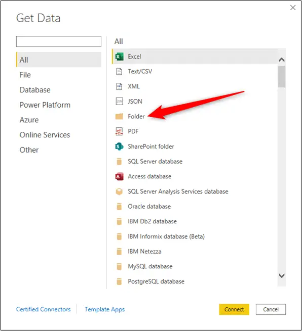
Click Home > Get Data > More.
A list of different sources you can connect to appears. There are a lot of sources and this list is always growing.
Select Folder and click Connect.
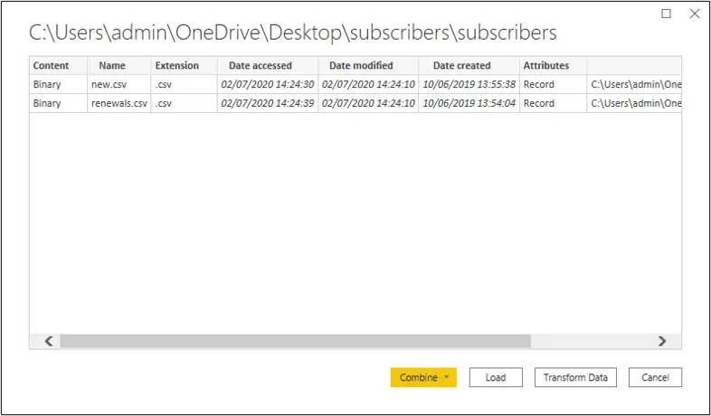
Click Browse and select the the folder you want to connect to. The path will be shown in the box. Click OK.

A window appears listing all the files found in that folder and some information about them such as their extension and date they were last accessed.
This folder contains two csv files. Click Transform Data.
The list of files is opened in the Power Query Editor for further transformations, before loading it into Power BI.
The name of the query can be changed in the Query Settings. I will leave this as subscribers. There is one applied step, which is the connection to the source. The path to the folder is shown in the Formula bar.

If you do not see your Formula bar, click View > Formula bar.
We will now combine them into one list. Click the Combine Files button in the Content column header.
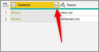
The Combine Files window appears with a preview of the files in that folder. Click Ok.
The two files are combined into one list. You will see multiple steps in the Applied Steps pane and also multiple queries in the Queries pane.
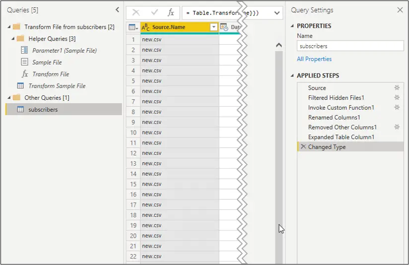
Do not be overwhelmed by these when starting out. Power Query has created and applied these to combine the files. We do not need to get involved with them (although we could).
The subscribers query is the only one that concerns us, for the moment.
A new column has been added with the name of the file. This is useful, but needs some tidying up.
Let’s remove its extension and then convert the text to proper case.
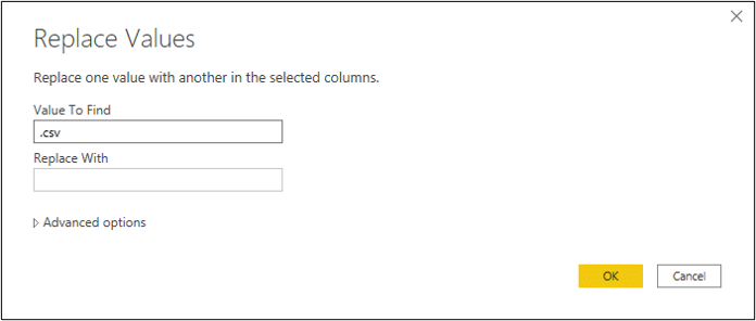
Select the Source.Name column and click Home > Replace Values.
Type .csv as the Value to Find and leave the Replace With box empty to remove that text from the column.
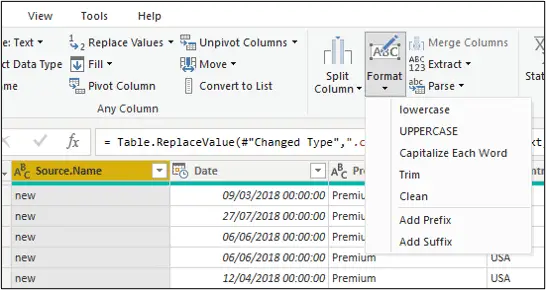
With the Source.Name column still selected, click Transform > Format > Capitalize Each Word.
Double click the header to change its name from Source.Name to something useful such as Type. This looks great now.
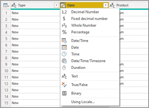
Before we finish this query, we should check the data types of each column. An icon is shown in the column headers identifying its data type, and also giving the opportunity to change it.
We need to change the data type of the Date column to remove the time, so click the data type button and click Date.
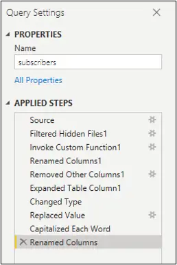
That is it for this query. All the steps were recorded in the Applied Steps pane so can be refreshed at the click of a button when the files in the source folder are changed.
We need to connect to two more sources so we won’t apply this query to the Power BI model just yet.
Next, we will get data from an Excel workbook.
Click Home > New Source arrow > Excel.
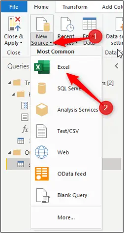
Browse to the subscribers folder that you downloaded to follow along, and select the Packages Excel workbook.
The Navigator window opens showing all the tables and worksheets in that Excel workbook. In this workbook, there is one table and one worksheet, and they contain the same information.
The table has better structure and is more reliable, so click the dProduct table and click Ok.
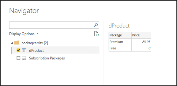
Although this example contains only one, you can select multiple tables or sheets of data to bring into Power BI.
This is a simple table with the name of the package (free or premium) and the cost of a premium package.
This query is now shown along with subscribers in the Queries pane.
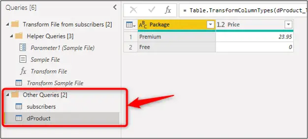
The d at the beginning of this queries name stands for dimension. This is unnecessary but is a practise observed by many BI professionals. You can prefix tables with a d for dimension and an f for fact tables.
Products is a dimension or lookup table. It contains entities about an event. In this case the products from a sale. Subscribers is a fact or data table. It contains the events, in this case sales.
There are no transformations to perform on this query, so let us go and get our final query.
This last data source will be a text file.
Click the New Source arrow > Text/CSV.
Browse to the location of the downloaded files and open the countries text file.
The preview window appears with the option to set a delimiter. this text file looks good except that the header row is not recognised as one. We will fix this in the Power Query Editor.
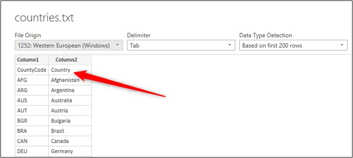
Click Home > Use First Row as Headers. The headers are now correct.
Edit the query name to dCountries.
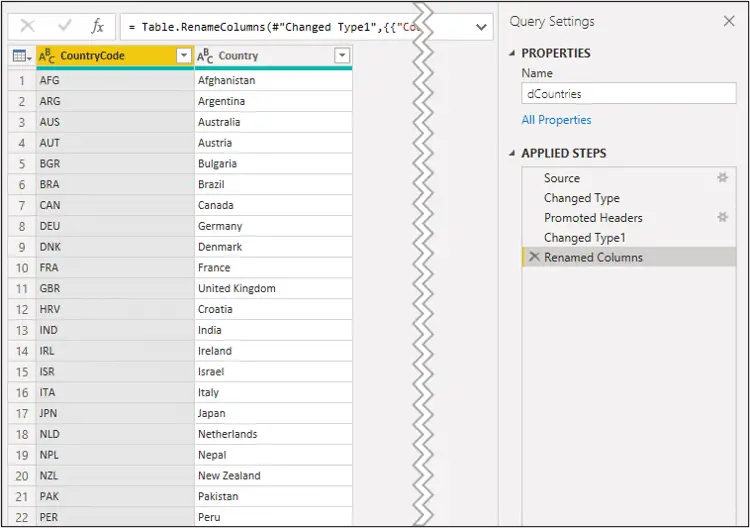
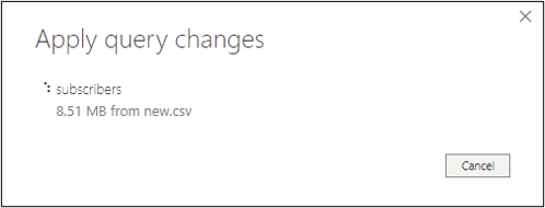
We can now click Home > Close & Apply to load these three queries to Power BI.
It may take a few seconds as the queries are applied. The subscribers fact table has a little under 1 million rows of data.
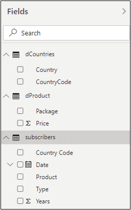
When applied you can see them in the Fields pane on the right of the screen. When in Report view, the calendar icon identifies date fields and the sigma (sum icon) identifies numeric fields.
Data Model and Creating a Date Table
We will now look at creating the data model by relating the three tables and then adding a date table.
We will begin by creating the relationships between the tables. Power BI may have had an attempt to auto detect these already.
We should check if these relationships exist, if they are correct, and make the necessary adjustments.
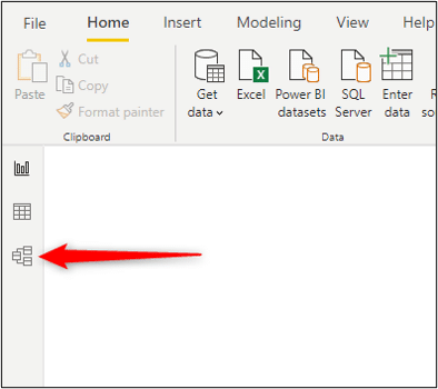
The easiest way to set up relationships is in Model view. Click the Model view button in the Views pane.
The three tables are shown here as boxes. You can move them around for better organisation. I prefer to have my dimension/lookup tables above my fact/data table in small models like this.
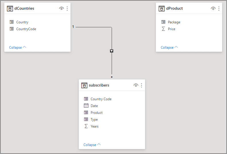
By default, Power BI is set to autodetect relationships between tables. This setting can be disabled in the options.
In this example, it has successfully set the relationship between the dCountries and the subscribers tables. However, it has failed to produce anything for the dProduct table.
You can position the cursor over the relationship line to check which fields form the relationships.
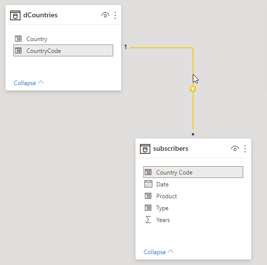
In this example, it successfully used the country code fields from each table. That is the common field that relates them (similar to using a lookup value with VLOOKUP in Excel).
The asterisk and the number 1 at either side of the line indicate a many-to-one relationship as we can have many subscribers from one country. The arrow is the filter direction (an important topic, but one that we will not explore in-depth in this tutorial).
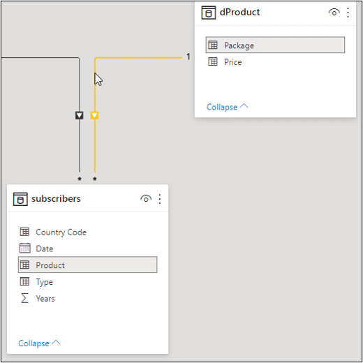
To create the relationship between the other two tables. Click and drag from the Product field in subscribers to the Package field in dProduct.
Although the fields have different names (the reason Power BI failed to recognise it) they are the common field. You can check the relationship by moving the cursor over the line.
Create a Date Table
A date table is important to have in your model, especially if you plan to do some time intelligence work.
In this Power BI introduction guide, we will create the date table in Power BI with DAX (you can also create date tables with Power Query).
Click the Data view button (middle one) in the Views pane.
Click Home > New Table.
The formula bar opens ready for you to name the table and write the DAX that creates it.
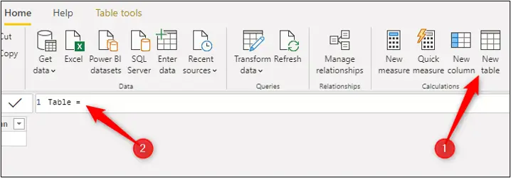
A date table must consist of every single date in every single year of the data you will use for analysis. This data is only for 2018 so we need all the dates from the 1st Jan 2018 to the 31st Dec 2018.
The following formula uses the CALENDAR function to create a list of every single day in that year and names the table dDate.
dDate = CALENDAR(date(2018,01,01),date(2018,12,31))
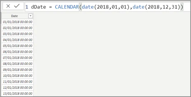
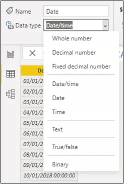
We do not need the date and time so select the Date column, and from the Column tools tab, click the arrow for the Data type and click Date.
We now need to add more columns to the table. We need a column for any date field we plan on using in a measure, chart, slicer or any other visual.
Let us start with a column for the month number. Click Home > New column and use the formula below.
MonthNumber = MONTH(dDate[Date])
This formula references the date column, which will be the base for all the other columns in this table.
We still reference the dDate table, even though we are in this table, because it helps to distinguish a column reference from a measure.
Ok, let us create some more columns quickly. Click Home > New column to begin each one. This formula creates a column with the month name.
MonthName = FORMAT(dDate[Date], "MMM")
The three M’s produce the shortened version of the month name e.g. Jan, Feb.
This formula will return the day of the week number. The 2 is used to specify that the week begins on a Monday.
DayofWeekNumber = WEEKDAY(dDate[Date],2)
Next, we will create a column for the day of week name.
DayofWeekName = FORMAT(dDate[Date],"DDD")
That is all the columns that we want for this example, but you can create as many columns as you might need such as year, quarter, year-qtr, terms etc.
At the moment, if we were to use the month name and day of week name fields in a Power BI visual, they would not be sorted correctly. Here is an example of them used in Table visuals.
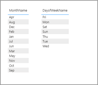
They are sorted in A-Z order which is not correct.
Excel can do this automatically because of its built-in custom lists, but Power BI does not have these. So, we need to explain to Power BI how to sort them. And that is why we have the month number and day of week number fields.
From the Data view, select the MonthName column, click Column tools > Sort by column > MonthNumber.
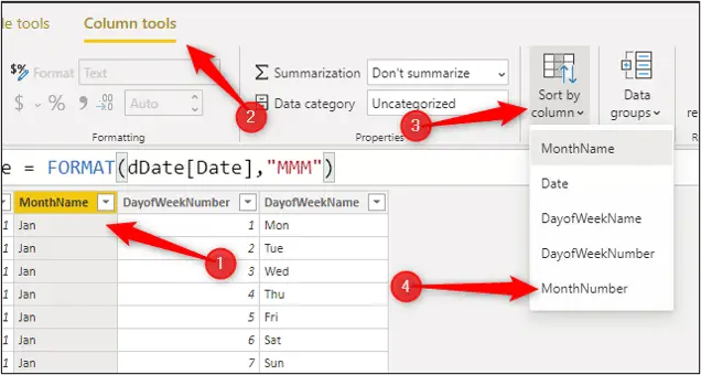
The MonthNumber column is now used to sort the MonthName.
Repeat this step to sort the DayofWeekName column by DayofWeekNumber.
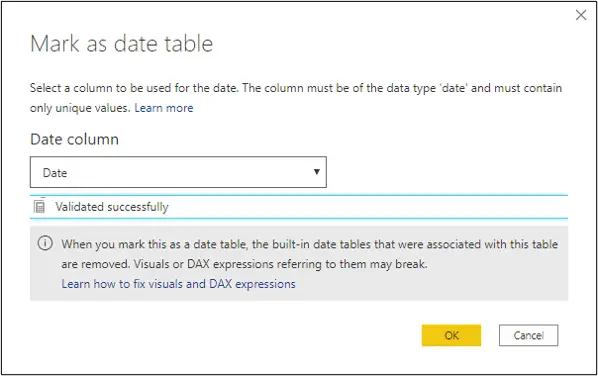
We will now mark this table as the date table. This makes Power BI aware of the date column to use and prevents it creating other date tables on the fly.
Click Table tools > Mark as date table arrow > Mark as date table.
Specify the Date column as the one to use and click Ok.
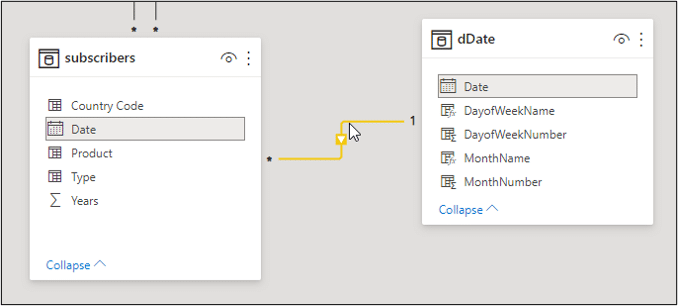
The last steps for the date table are to relate it to the other tables in the model, and hide unnecessary fields. Switch to the Model view.
Click and drag between the Date field of the subscribers table to the Date field of the dDate table.
Right-click on the MonthNumber field and click Hide in Report view. The field is still visible here but will not be in the Report view. This reduces clutter as we do not need to see fields that we will not use in a visualisation.
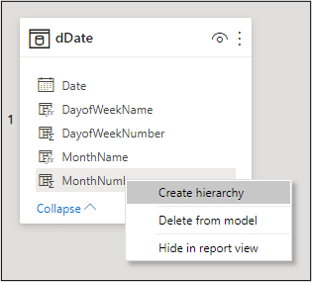
Repeat this step for other fields to hide such as the DayofWeekNumber field and fields used as keys to relate the tables.
Power BI Introduction to DAX Formulas and Measures
Let us get more involved with DAX now, the formula language of Power BI.
Watch the Power BI introduction video for a more detailed explanation of the formulas used.
These are some questions that we want our Power BI reports to answer.
- How many subscribers did we get this calendar year (2018 in the sample data)?
- How many of the subscribers are on the free plan, and how many on the premium plan?
- What was the total revenue from our premium subscribers?
- What is the percentage of the total subscribers that are premium?
Four nice simple questions that will give us a nice introduction to DAX measures to answer.
Switch to Report view. You can create measures from the Data or Report views, but Report view is best as we can test them in visuals here.
Click on the subscribers table in the fields pane on the right to make it active. This is where the measure will be stored.
Click Home > New Measure.
Type the following measure into the formula bar. This measure will return the total number of subscribers.
Total Subscribers = COUNTROWS(subscribers)
The measure name is Total Subscribers, equals to begin the formula and then a function named COUNTROWS is used on the subscribers table.
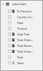
The measure appears in the subscribers table with a calculator icon. This is the measure indicator.
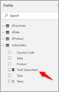
The next measure will return the number of subscribers who joined the free plan.
Select the subscribers table and click Home > New Measure.
Total Free = CALCULATE([Total Subscribers],subscribers[Product]="Free")
The CALCULATE function is one of the most important in DAX. The can change and remove filters on the fly. DAX is all about controlling these filters from the table relationships, the visuals in the report and also the formulas.
This measure also reused the Total Subscribers measure, so that one calculation can be used many times which is great.
And here is the measure to return the number of premium subscribers.
Total Premium = CALCULATE([Total Subscribers],subscribers[Product]="Premium")
The next measure is to return the total revenue.
Total Revenue = [Total Premium] * SUM(dProduct[Price])
This is a simple formula of multiplying the previous total premium measure by the price in the products table.
You cannot just reference a cell like in Excel, so the SUM function is used to aggregate.
The final measure is to return the percentage of subscribers that were premium. The DIVIDE function is used for this.
% Premium = DIVIDE([Total Premium], [Total Subscribers], 0)
With the measure selected, click Measure tools and format the measure as a percentage.

All measures are added to the subscribers table.
Build the Reports and Interactive Visualisations
We are now ready to build different visualisations and to setup how the audience will interact with them.
Watch the video for a detailed walkthrough of creating 2 reports.
Switch to the Report view.
Adding and Formatting Visualizations
The first visualisation will be a card. These are great for overview information at the top and side of a report.
Click the Card button in the Visualizations pane and drag the Total Revenue measure into the Fields box.
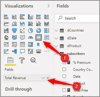
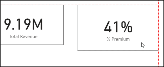
You can drag and resize the card however you wish. If I added a second card for the % Premium measure, lines are shown to help me align them with each other.
To format the visualisation, ensure it is selected on the report page and click the Format icon in the Visualizations pane.
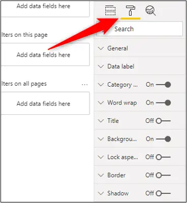
The formatting options you see will depend on the visualisation you have selected. The above image shows just some of the categories for working with a card. There are a lot of options to explore.
To add another visualisation, click somewhere on the report page to deselect all visuals, then click the one you want in the Visualizations pane.
Click the Clustered column Chart and drag the Total Premium and Total Free measures into the Values field.
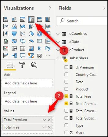
Click the Format button to improve on its standard appearance.
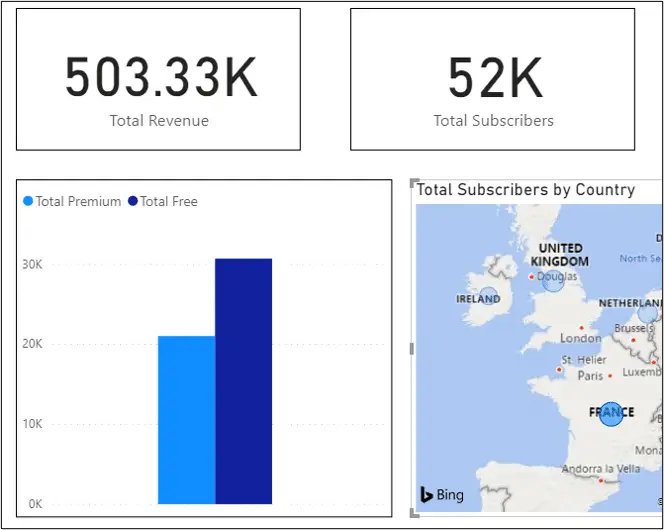
This is the report so far.
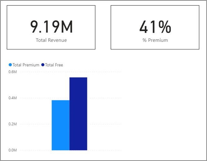
There are many visualisation options including maps, line graphs, slicers and a matrix. This tutorial would be too long to mention more.
The video goes into more detail. Also explore what they can do and check out the formatting options available.
Edit Interactions Between Visualisations
The visualisations you add all interact with each other. When you click a visualisation it will filter or highlight the other visualisations on the page.
In the image below, France has been clicked on the map chart. This has filtered the cards along the top (check the revenue here against the previous image) and highlighted to France contribution in the column chart.
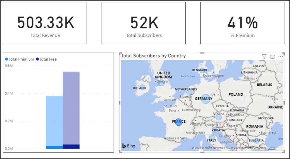
This is very powerful and useful. But it needs to be set up correctly so that your report functions as you want it to. And the audience do not get a shock if the report does something they do not expect.
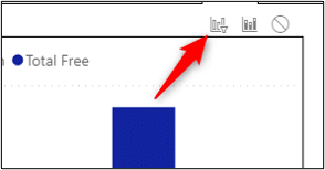
To edit how a visualisation interacts with others. Click the visual, click Format > Edit Interactions.
Options are shown on each visualisation. You can see that the column chart has one extra option to the cards.
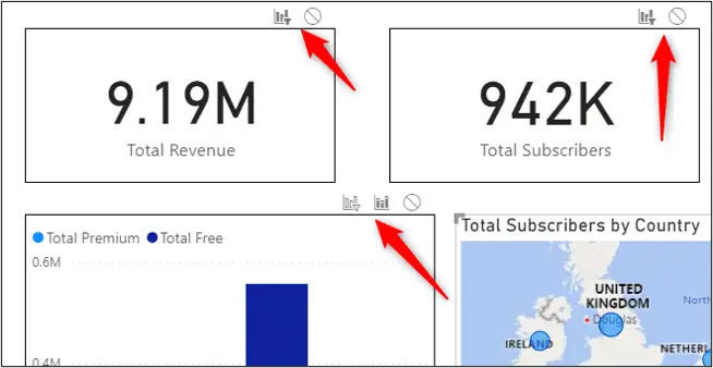
The cards have the filter or none options only. But the column chart has filter, highlight or none. So the options you get depend on the visual.
We will change the column chart from highlight to filter by clicking the Filter option.
Now when a country is clicked in the map the column chart is filtered instead of highlighted like in the previous image when France was clicked.
You will need to select each visual and change how it interacts with the other visuals on the page. Otherwise someone reading the report could get a surprise.
Click the Edit Interactions button again to switch it off.
Power BI has many more powerful filter and interaction options including the brilliant Drill Through technique.
Publish to the Power BI Service
When your report is complete you will want to share it with other readers.
There are a few options for this. You could just share the .pbix file just like you would share an Excel workbook or Word document. You could also save the report as a PDF, or embed it on a web page (Pro version needed for this).
The most common way though is to publish the report to the Power BI service. You need to be signed in to do this.
Click Home > Publish.
You will be prompted for the workspace you want to publish to. You have a My workspace to begin with. you can create other workspace on the service.
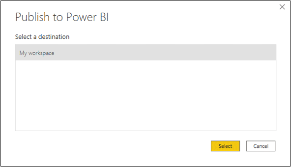
Select the workspace and click Select. A message appears when the report is published and a link to open it.
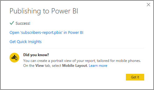
The report is fully interactive on the service. There is also functionality to edit the report, to create dashboards from report elements and much more.
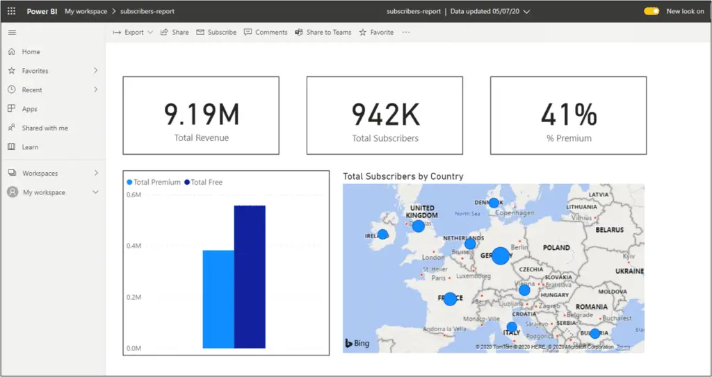
This Power BI introduction guide should give you a strong head start in using the tool to create amazing reports. This is much more to Power BI and also it is a tool that is constantly being updated, so keep learning and developing.


EXCELLENTJOB SIR VERY VERY HELRFULL TOME
Great to hear. Thanks Kiran.