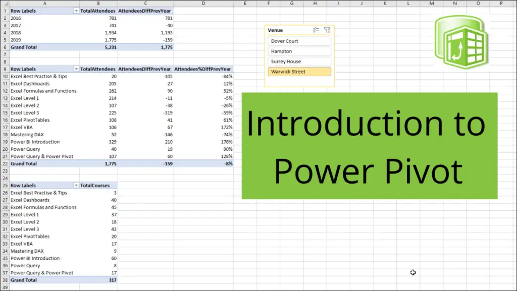
I am often asked – What is Power Pivot in Excel?
And how did you get that tab on your Ribbon?

In this Excel Power Pivot introduction tutorial, we will explain what Power Pivot is. And why you will want to use it.
Table of Contents
- Watch the Video
- What is Power Pivot?
- The Excel Power Pivot introduction Scenario
- Enable the Power Pivot Add-In
- Import the Data
- Model the Data
- What is DAX?
- Create DAX Measures
- Create PivotTables using the Power Pivot Data Model
Watch the Video
Watch this comprehensive Power Pivot introduction video taking you through the entire process from getting data through to analysing it with PivotTables.
Download the files to follow along.
Below are the written steps demonstrated in the video.
What is Power Pivot?
Power Pivot is also known as the data model in Excel and it enables us to create complex models of our data ready for analysis.
The advantages to using Power Pivot are;
We can work with large volumes of data surpassing the 1,048,576 limitations of Excel. Neither will Power Pivot be affected by using > 100,000 rows of data in the way that Excel is.
We can use the powerful DAX formula language. This rich formula language offers more powerful calculations than the worksheet formulas in Excel, and a lot more options than stand-alone PivotTables.
We can work with multiple tables or sources of data.
Classic Excel use requires data to be imported, or entered into Excel. Then combined into one table using techniques such as VLOOKUP. This is inefficient.
Now that is not to say that it is bad. That approach works fine for small volumes of data, few tables and when data is stored in Excel.
But when dealing with large volumes from many different external sources. Power Pivot is far superior.
The Excel Power Pivot Introduction Scenario
The scenario that we will work through in this article is that we run a training company and store data about our courses, training venues, and courses we have run in different places.
Download the files used in this article to follow along.
We have 4 CSV files stored in a folder that contain all the courses that we have run for the last 4 years. One for each year of transactions.
We then also have an Excel spreadsheet that contains 3 tables. A table with details of the different courses we offer, one for the venues we have and another for the calendar table.
The typical use of Excel would see users copy and paste the data from the 4 transaction files into one table. And then use lookup formulas to bring the details about the courses and venues into new columns of the transaction table.
With Power Pivot we will connect to those sources (so they update in the future) and then relate them. No data imported to a worksheet and no formulas for new columns.

This is a simple model to get an understanding of Power Pivot. However, data can be imported from any source (databases, websites, text files, etc) and they can be larger than the files used in this example.
Enable the Excel Power Pivot Add-In
Power Pivot is a COM add-in. So you won’t see the tab on the Ribbon if you are new to using it.
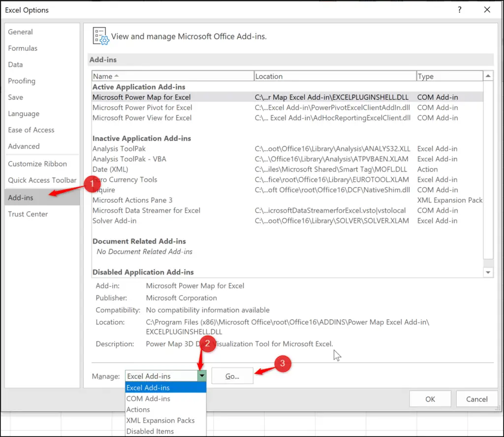
To enable the add-in, click File > Options.
Click the Add-ins category, then select COM Add-ins from the Manage list and click Go.
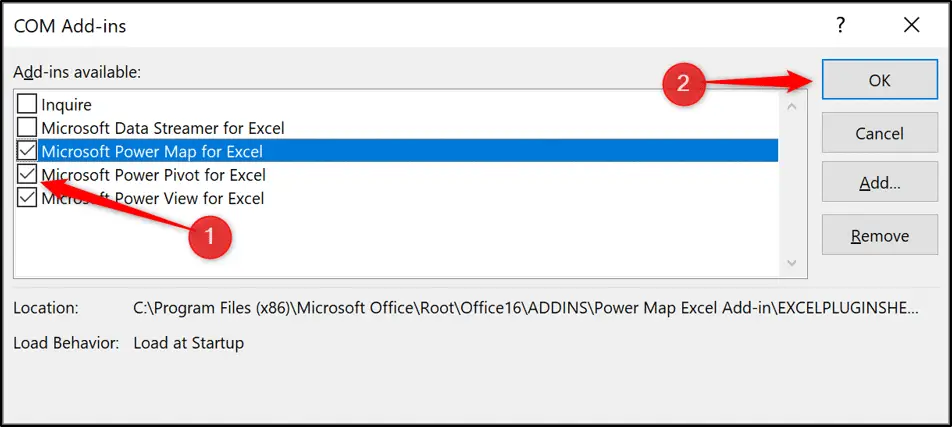
Check the box for Microsoft Power Pivot for Excel and click Ok.
The Power Pivot tab is now added to the Ribbon.
There are now two main ways to access Power Pivot. You could use the Power Pivot tab to manage the data model, create measures and more.

You can also click the Manage Data Model button on the Data tab to open the Power Pivot window.

The Power Pivot window provides full functionality, while the Power Pivot tab enables you to perform actions such as create measures quicker (more on creating measures later).
Import the Data
Let’s start to import the data from those different sources into our model.
You can do this in Power Pivot, but the options you get are limited. So you are heavily encouraged to use Power Query for this task.
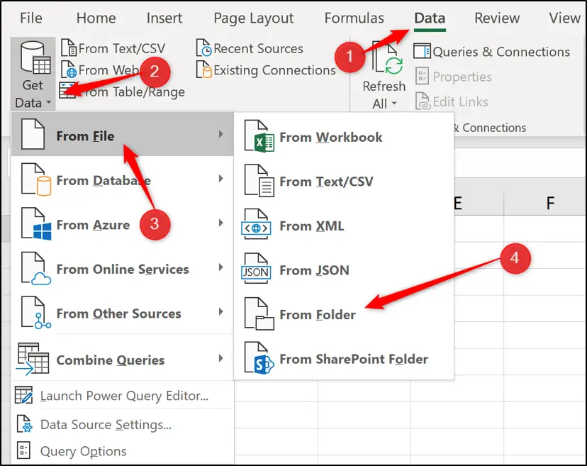
To import the 4 CSV files from the folder, click Data > Get Data > From File > From Folder.
Click the Browse button in the Folder window and locate the folder containing the CSV files. Click Ok.
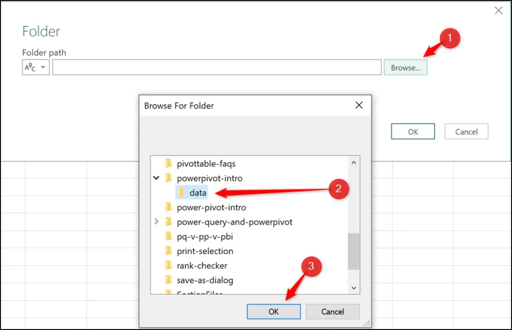
The folder path is displayed. Click Ok.

A window appears listing all of the files in that folder including information such as last modified dates and file extensions. Click Transform Data.
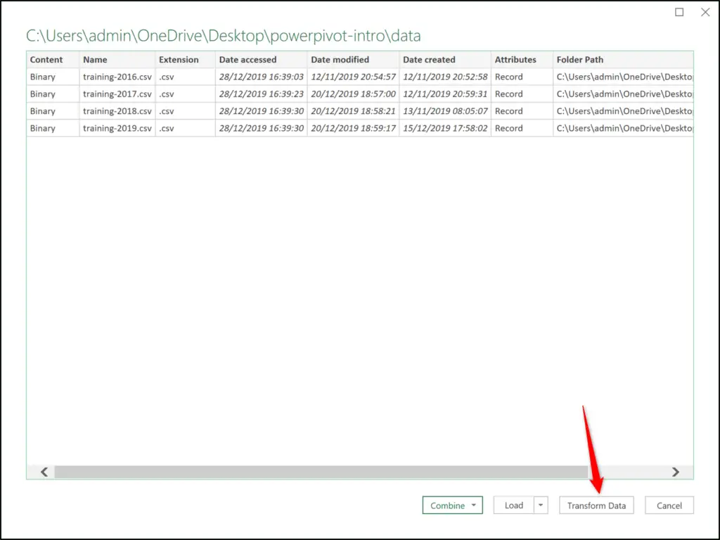
This opens the Power Query Editor. At this point you could filter out files you do not need and do other transformations.
However, this article is about Power Pivot, so we will connect to the files and do almost no transformations (Power Query tutorials to learn more)
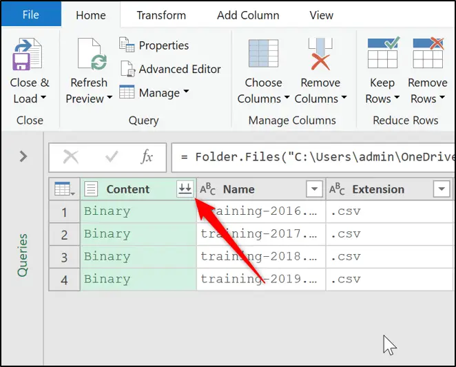
Click the Combine Files button. This will stack all 4 CSV files into one table.
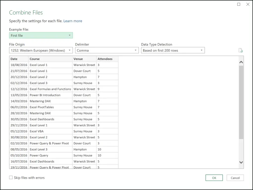
The Combine Files window provides an opportunity to preview the files. Click Ok.
All the files are stacked (appended) into one table.
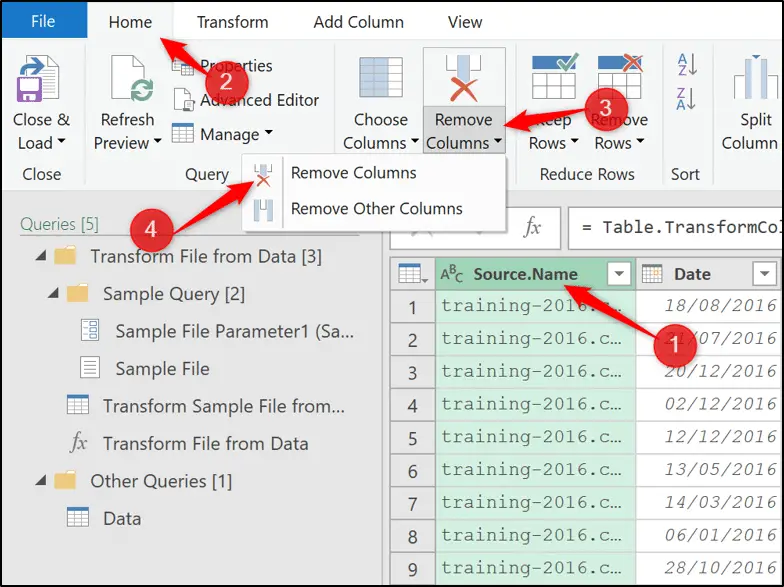
The first column with the file name is not required. Select the column, then click Home > Remove Columns list > Remove Columns.
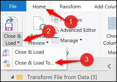
Now we will load it into the data model. Click Home > Close & Load list > Close & Load To.
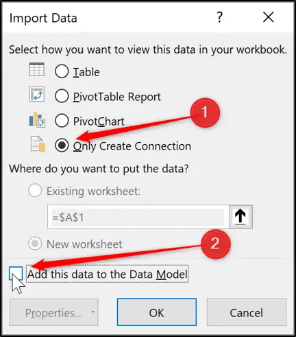
Select Only Create Connection (the data is Not loaded to the worksheet) and check the box to Add this data to the Data Model.

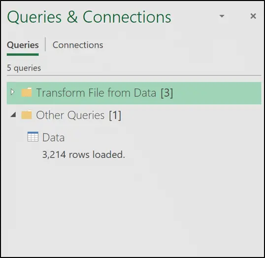
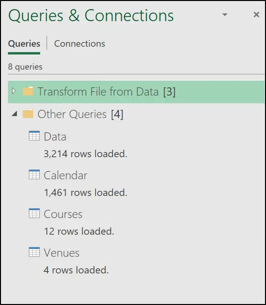
The query is loaded to the model and shown in the Queries and Connections pane on the right. Ignore the other queries, they were used by Power Pivot to extract the files and stack them.
It shows 3,214 rows loaded. Remember, this is a simple model, but because it was loaded to Power Pivot and not the worksheet – this could have been millions of rows.
Let’s now import the 3 tables (courses, venue, and calendar) from the Excel workbook.
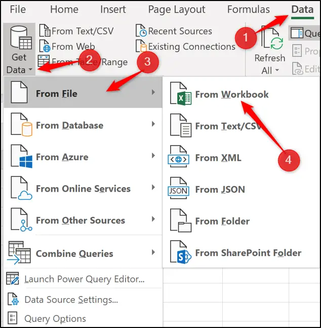
Click Data > Get Data > From File > From Workbook.
Navigate to the Excel workbook, select it and click Open.
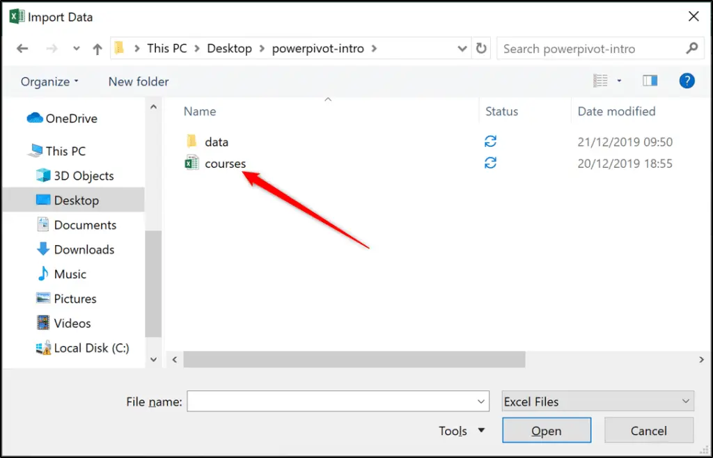
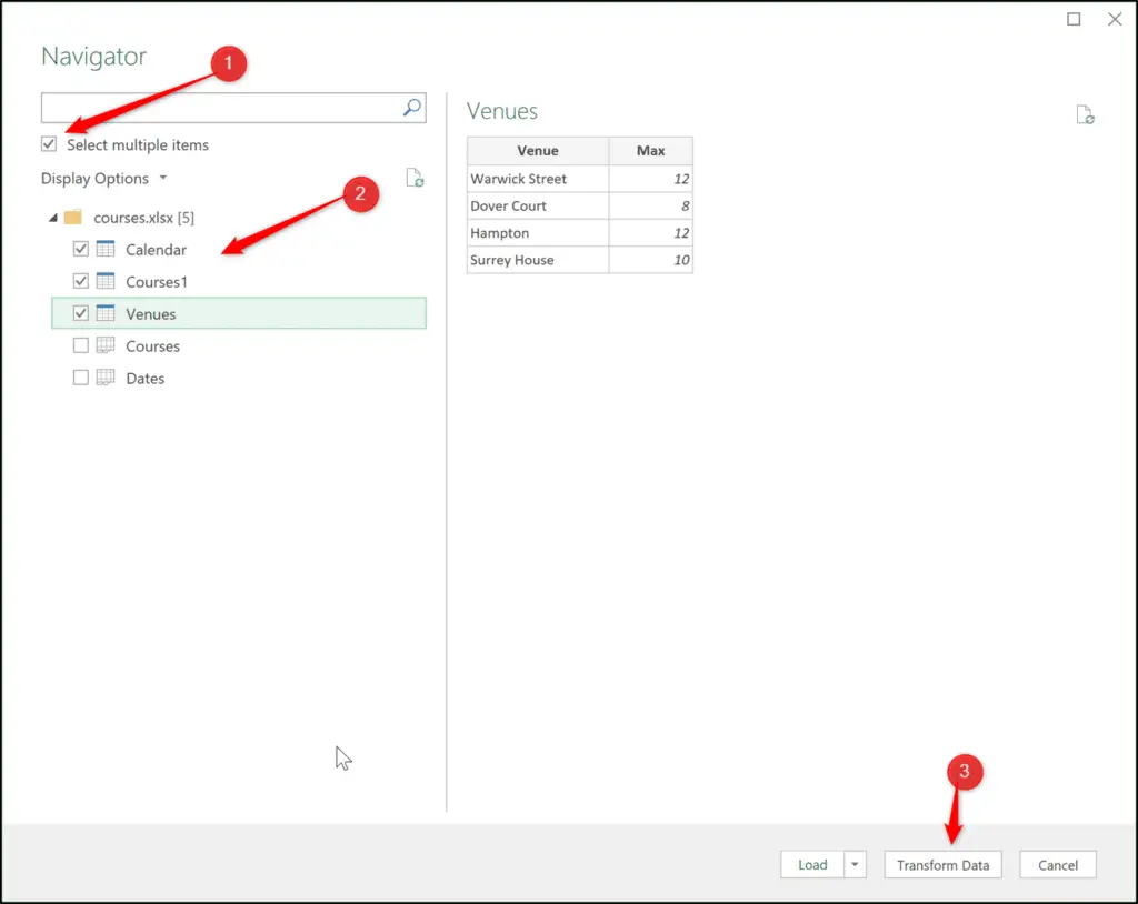
The Navigator window opens showing the tables and worksheets from the workbook. As you select the table or sheet a preview is shown on the right.
Check the Select multiple items box. Check the “Calendar”, “Courses1” and “Venues” boxes and click Transform Data.
The 3 tables/queries are loaded and shown on the left of the Power Query Editor.
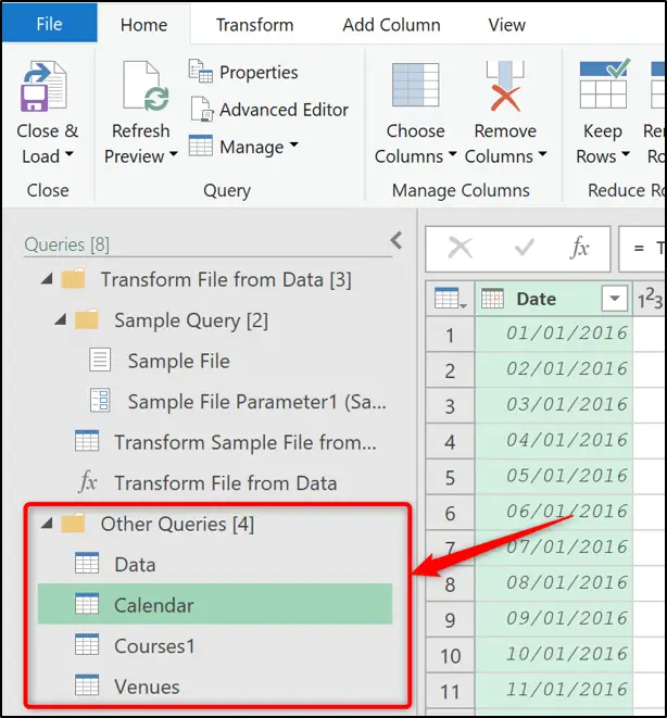
As mentioned already in this tutorial, we will not be doing any transformations here. Check out other Power Query tutorials on the site to learn more about what is possible.
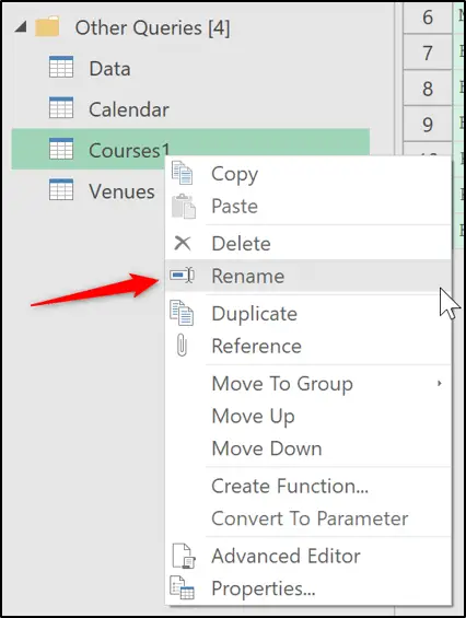
This data is perfect and needs no modifying, except we will edit the name of the “Courses1” query to “Courses”.
Right-click on the “Courses1” query, click Rename and edit it to “Courses”.
Then just like with the previous query, click Home > Close & Load list > Close & Load To.
Select Only Create Connection and check the box to Add this data to the Data Model.
Those three queries are loaded.
We now have the transactions table (also known as a Fact table) – “Data” and the three lookup tables (also known as dimension tables) – “Calendar”, “Courses” and “Venues”.
Model the Data
If we were to create a PivotTable from the model now to total the number of attendees for each course over these four years.
We could put the “course” field from “Courses” tables into rows and the “Attendees” field from the “Data” table into the Values area and you would see the below.
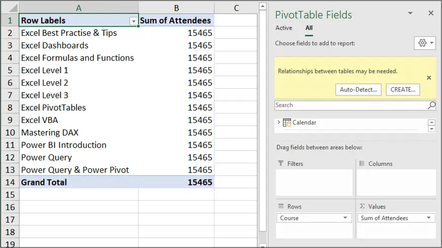
Now, this clearly is not working because we have the same value for every course in the PivotTables and the total.
We also receive a warning at the top of the field list that relationships between tables may be needed.
So at the moment, we have 4 independent tables that do not know how to communicate with each other. So we will build relationships between them – don’t worry it’s super easy.
This is instead of the classic Excel use of VLOOKUP being used to drag the course information into the “Data” table to be used.
Click the Power Pivot tab and then the Manage button.

Click the Diagram View button on the Home tab.

This is the easiest view to manage your relationships because it is very visual. You can see your four tables.
You can click and drag these tables around the page to organise them better.
Normally they are organised with the transactions tale in the middle and the lookup tables scattered around it like a star.
Or as I have done below with the lookup tables above and the transactions table below. This is so the transaction table has to ‘look up’ to the lookup tables to retrieve information about venues, courses or dates.
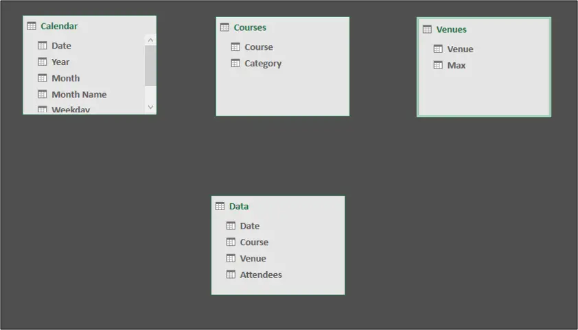
The tables can also be resized. These tables are very small, but some lookup tables can have 20+ columns of data.
To create a relationship between tables, click and drag from field in the transaction table (Data) to the related field in the lookup table (Just as you would use a lookup value into the first column of the table array with VLOOKUP).
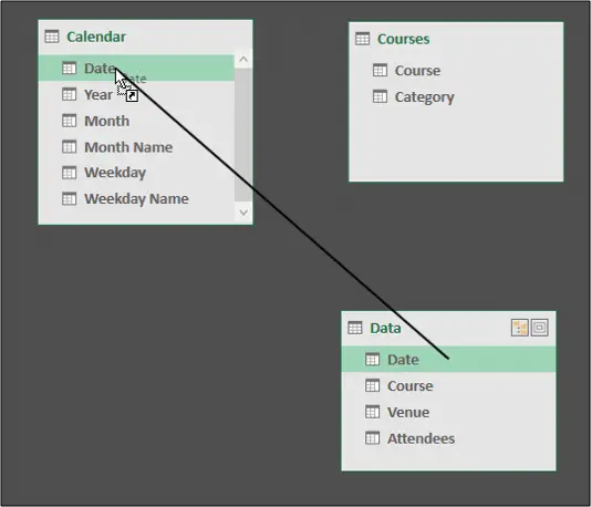
Repeat this step for all three lookup tables.
Lines are shown indicating the relationship between the tables.
You can see a * symbol at the end of the line by the transaction table, and a 1 at the end of the line by the lookup table. A many-to-one relationship (one venue can be used for many courses).
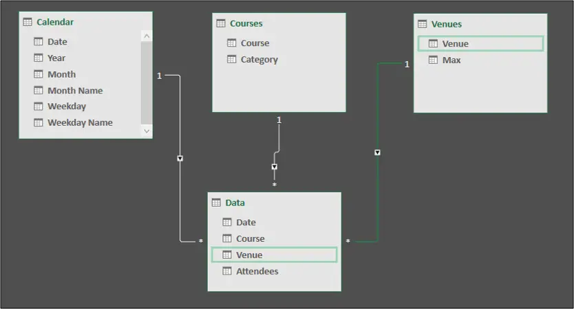
There is also an arrow showing the filter direction from the lookup tables to the transaction table. So we can filter the data in a PivotTable by course, venue, month etc.
Next, we need to make some simple improvements to the “Calendar” table.
At the moment, if we used the “Month Name” field from the “Calendar” table in the rows field of a PivotTable we would see this.
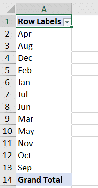
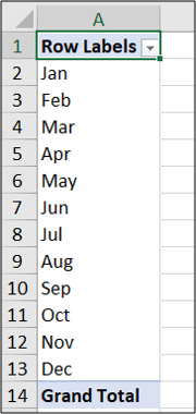
The months are sorted in A to Z order.
Excel has Custom Lists which tell it how to order names of months and names of days of the week.
Power Pivot does not have this, so we will explain to it how to sort those fields correctly.
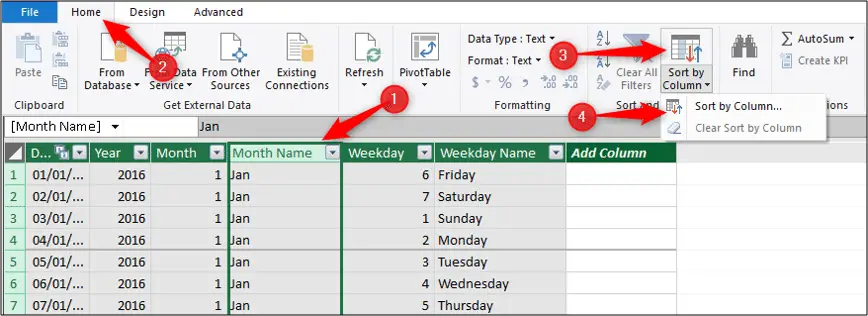
Click on Home > Data View.

And then click on the Calendar tab at the bottom of the screen to switch to the “Calendar” table.
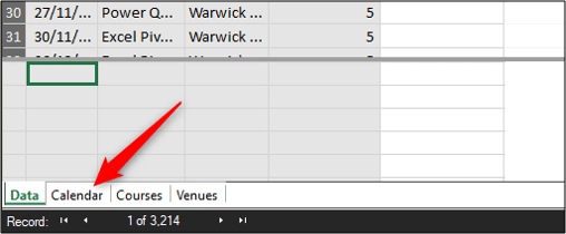
Select the “Month Name” column and click Home > Sort by Column list > Sort by Column.
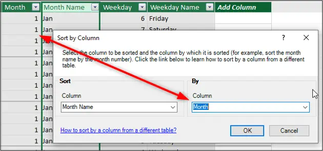
In the Sort by Column window, the “Month Name” column will already be in the first list because the column was selected before opening the window.
In the second list, select the “Month” column. So we will sort the months’ name, by the months’ number i.e. 1 for January, 2 for February etc.
The PivotTable can now sort the month names correctly.
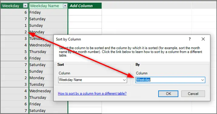
Now repeat the process for the “Weekday Name” column of the “Calendar” table to be sorted by the “Weekday” column.
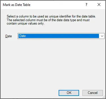
The final task for this modelling section is to mark the “Calendar” table as the date table.
This is important for effective time intelligence analytics. By telling Power Pivot which table to use for date calculations, it prevents Power Pivot from creating its own date table each time you use a date field in PivotTables.

You are asked which column of the “Calendar” table contains the dates. Select the “Date” column and click Ok.
What is DAX?
DAX stands for Data Analysis Expressions and it is the formula language behind Power Pivot.
It is a very rich language, there are many formulas and it is constantly evolving. This DAX Function Reference will help keep you up to date with new and updated DAX formulas.
It can take some time for Excel users to become comfortable with DAX. And in this tutorial, we will go through some nice examples to get a feel for DAX formulas.
There are two types of DAX formula; measures and calculated columns. In this tutorial, we will only focus on measures. Calculated columns have limited use.
What Are The Advantages Of Using DAX?
DAX formulas can be re-used, but are only calculated once.
If you have a field named ‘Total’ that you drag into multiple PivotTables to create different analytics such as total by month, total by region etc – that total is summed multiple times. These are known as implicit measures.
Summing a ‘Total’ field with a DAX measure means that you can use it again and again in different PivotTables (and also other measures) but it only calculates once.
This is far more efficient, especially when dealing with large datasets.
There are hundreds of DAX functions. A standard PivotTable offers only 11 functions – sum, average, standard deviation etc.
DAX measures can be formatted when they are created. This helps ensure a consistent look in your reports, and also saves you formatting the value every time it is used.
Create DAX Measures in Excel Power Pivot
Let’s create five DAX measures to get a feel for the language in this Excel Power Pivot introduction.
We will do this from the Power Pivot tab on the Ribbon, so click the Switch to Workbook button to go back to Excel.
Measure #1
Click Power Pivot > Measures list > New Measure.

Our first measure will be to sum the total number of attendees.
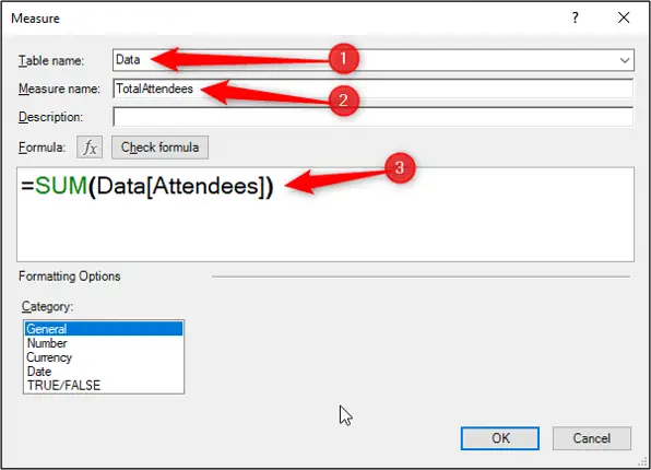
In the Measure window, we will complete the following fields;
Table name: We will store this measure in the “Data” table. All of our measures will go into this transactions table.
Measure name: “TotalAttendees”. It is a good idea to avoid spaces when naming measures and tables.
The formula we will use is shown below.
=SUM(Data[Attendees])
When typing into the box provided you can press the Ctrl key and scroll your mouse wheel to zoom in and out of the area making the formula easier to read.
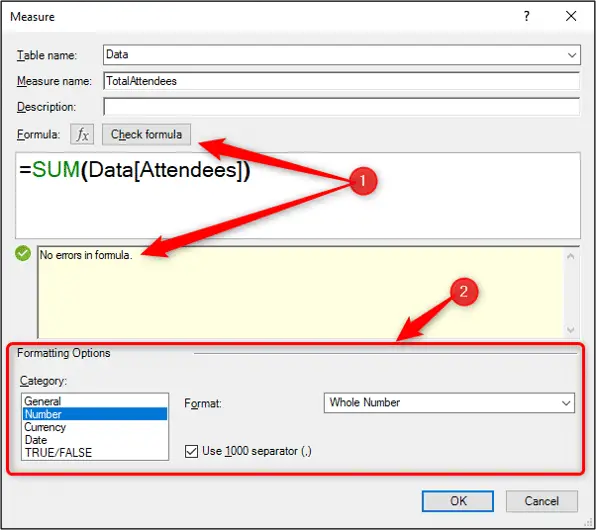
Click the Check Formula button to confirm there are no errors.
The formatting will be set as a Number as a Whole Number format and check the box to Use 1000 Separator (,).
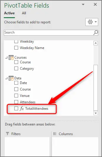
The created measure is visible in the “Data” table of the PivotTable field list.
Measure #2
We will now go through the process again to create a measure that counts how many courses we have run (number of transactions) over these 4 years of data.
Click Power Pivot > Measure list > New Measure to open the Measure window.
This measure will also be stored in the “Data” table. The measure will be named “TotalCourses”. It will be formatted as a whole number with a thousand separator and we will use the formula below.
=COUNTROWS(Data)
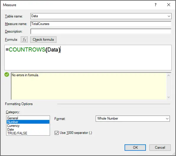
This function is interesting as Excel does not have a COUNTROWS function, but DAX does. So it is an example (not the last) of the extra functions that DAX provides.
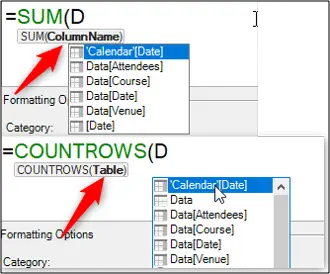
With this function, we provided the “Data” table as the function argument. The SUM function prompts for a table column, while this function prompts for a table. Something to keep your eye out for when writing DAX.
Measure #3
Ok, for the third measure we want to calculate how many attendees we had on our courses in the previous year.
Create a measure in the “Data” table, with the name “AttendeesPrevYear” and formatted as a whole number with a thousand separator. The formula below is used.
=CALCULATE([TotalAttendees],DATEADD('Calendar'[Date],-1,YEAR))
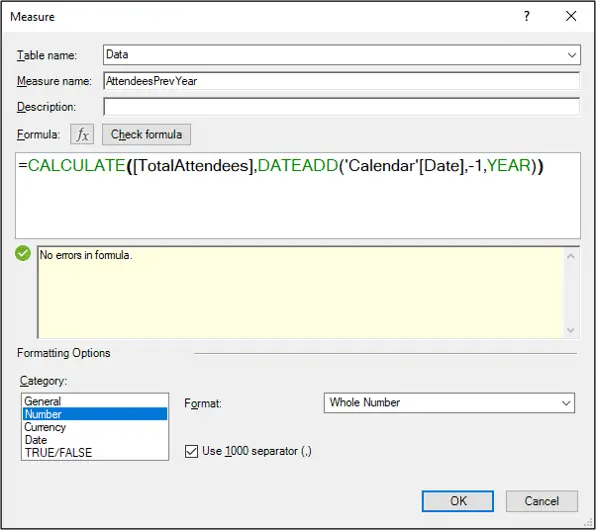
This function uses two new functions which are both only available in DAX – CALCULATE and DATEADD.
The CALCULATE function is the most important function to know in DAX. It can add and remove filters from an expression and also change the evaluation context. It is very useful.
This example also demonstrates the “TotalAttendees” measure being reused. So we didn’t have to re-write the SUM function.
Measure #4
The fourth measure is to find the difference in the total attendees to the previous year.
Create a measure in the “Data” table named “AttendeesDiffPrevYear” formatted as a whole number with a thousand separator. The formula we will use is below.
=[TotalAttendees]-[AttendeesPrevYear]
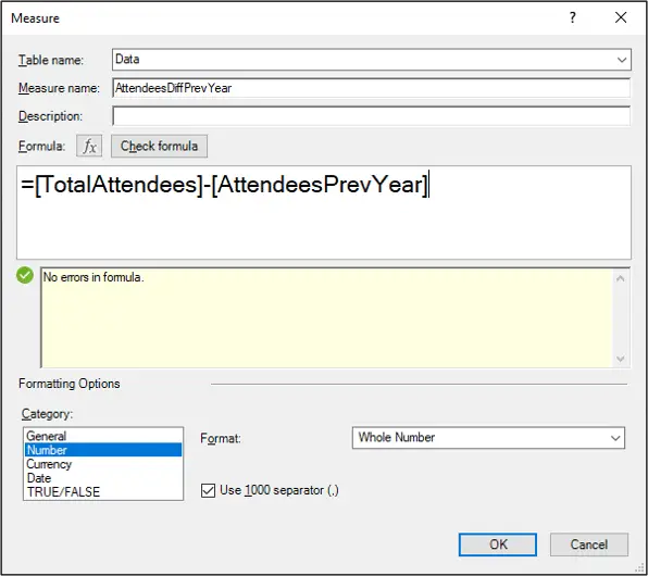
This measure uses two measures we created previously.
It is a good idea to test your measures to ensure they work before you use them in some deep analysis. And the last two measures are a good example of ones we might want to check.
In a PivotTable, I have placed the “Year” field from the “Calendar” table into the Rows area, and in the Values area placed the “TotalAttendees”, “AttendeesPrevYear” and “AttendeesDiffPrevYear” measures.
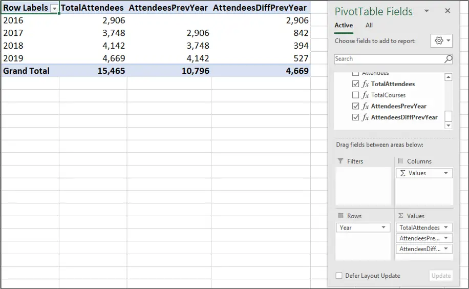
We can see three of our measures working correctly here. The “TotalAttendees” measure returns 15,465 for the total attendees in the entire data.
Then the “Year” field provides row filter context and you can see the 2016 total of 2,906 and in 2017 the previous year (2016) also as 2,906 confirming that it works.
And then you can see the “AttendeesDiffPrevYear” measure working as 2,906 + 842 = 3,748.
Now I’m not saying you should use the “AttendeesPrevYear” measure in this PivotTable because it serves no benefit. It was created to be used in the “AttendeesDiffPrevYear” calculation and possibly others.
But using it here it gives us a nice quick way of checking if it is working before we create more measures with it.
Measure #5
In our fifth measure, we want to calculate the percentage difference of total attendees compared to the previous year.
Create a measure in the “Data” table named “Attendees%DiffPrevYear” formatted as a percentage and no decimal places. The formula we will use is below.
=DIVIDE([AttendeesDiffPrevYear],[AttendeesPrevYear],0)
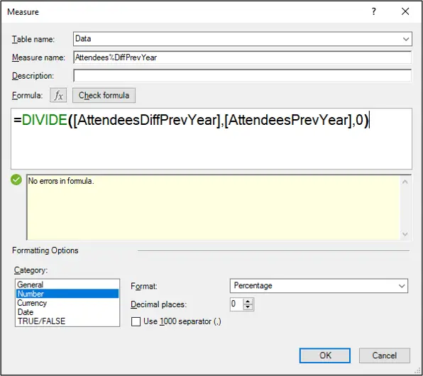
This measure uses the DIVIDE function (another that is not in Excel, and is unique to DAX). This function is a safe divide function, and the zero on the end is returned instead of a #DIV/0! error.
It also uses both of our previous two measures we created.
Note the percentage formatting has been applied. So we won’t need to do this again when it is used in PivotTables.
Create PivotTables using the Power Pivot Data Model
So we have imported data from multiple files in a folder and also from multiple tables in an Excel workbook. Then we modelled the data and created relationships. And then we wrote some DAX calculations.
The final stage is to create PivotTables using these fields and DAX measures to produce some analytics and reports.
This is not going to be an amazing fancy dashboard, but it will be a few PivotTables and Slicers to get a feel for how it all works together and what is possible with Power Pivot.
Now, this is not a tutorial on PivotTables so I won’t go into detail here, that is for another time. But let’s look at how to create a PivotTable using our data model.
Click Insert > PivotTable.
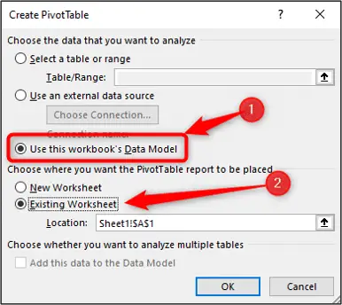
Excel automatically picks up that you have a data model in this workbook and assumes you would like to use it for your PivotTable.
We have a blank workbook (data is all loaded to the model, nothing on the sheets) so we may as well insert the PivotTable onto the existing sheet.
The field list for the PivotTables shows all the tables of our data model. A small icon to indicate they are from the model, and an arrow to expand them and access the fields.
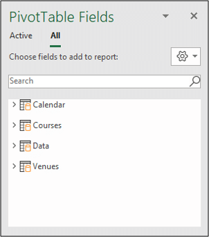
The “Data” table contains all of the measures and is filtered by the lookup tables.
So use the measures in the Values area of the PivotTable, and the fields from the other tables in the Rows, Columns, Filter areas and in Slicers.
Apart from knowing that, everything else about using PivotTables is no different to when using them from a single table.
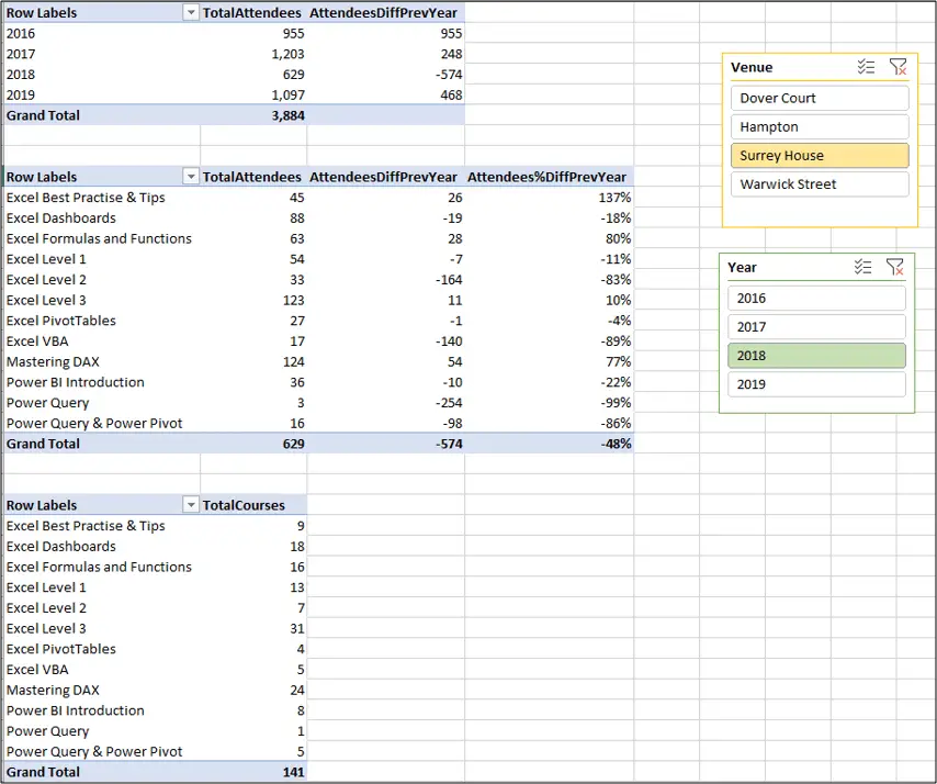
The report below has three PivotTables and two Slicers. It uses all five of the measures we created, and all four tables that we imported. So it’s a nice example of a functioning Power Pivot data model.
You watch this being created in the video at the start of this Excel Power Pivot introduction tutorial.
Power Pivot can be a very useful tool for anyone dealing with large quantities of data and needs to analyse it.
I hope that this Excel Power Pivot introduction was useful. There is a lot more you can get your teeth into on your journey to mastering Power Pivot, especially with DAX.
And if you find Power Pivot useful, you should also check out Power BI.


