A bar in bar chart is a great way to compare two values such as actuals against target, this week v’s last week, or progress toward a goal.
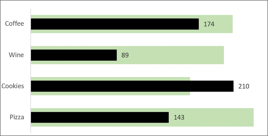
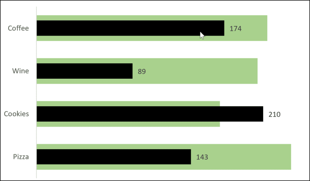
In this blog post, we will demonstrate two different ways to create a bar in bar chart like the one below. This shows the actual values (black) against the target values (green) very neatly and clearly.
Watch the Video
Watch the video is see how to create a bar in bar chart, or read on for the step by step process.
Create a Bar in Bar Chart in Excel
We will create a bar in bar chart using the data below.
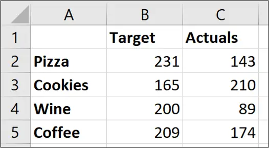
Select the range of cells. A1:C5 with this data.
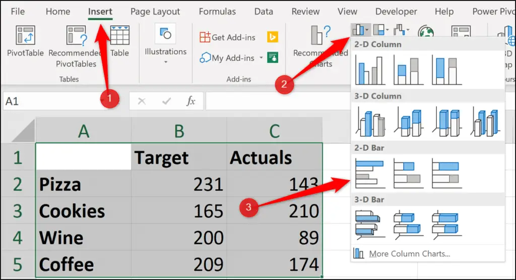
Click Insert > Insert Column or Bar Chart > Clustered Bar.
A bar chart like below will be inserted.
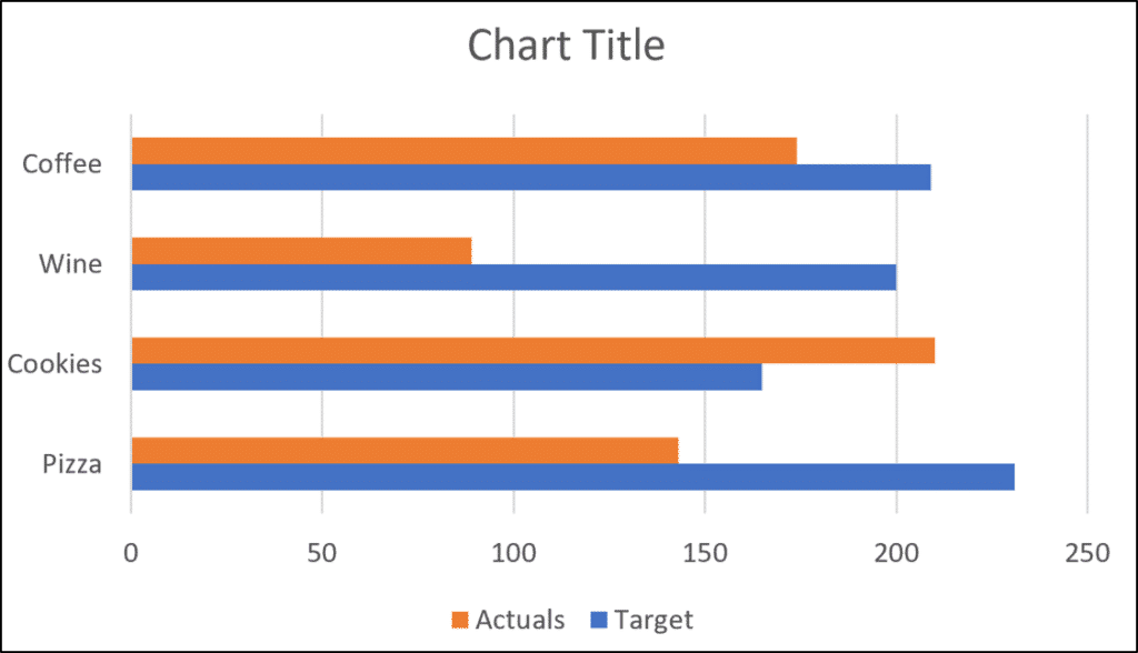
We need to overlay the “Actuals” column over the “Target” column.
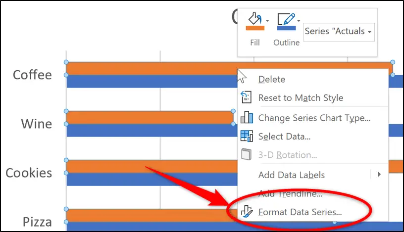
Right-click on the “Actuals” column and click Format Data Series.
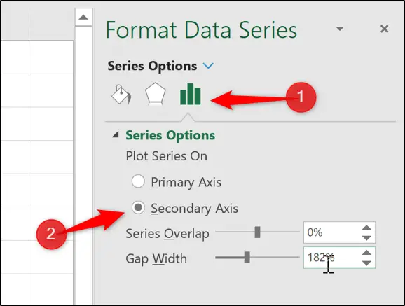
Click the Series Options category and then click the plot series on the Secondary Axis option.
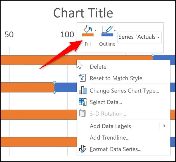
The actual values now overlay the target values.
Next, we can change the colour of the columns to what we want. Right-click the data series, click Fill and choose the colour that you want.
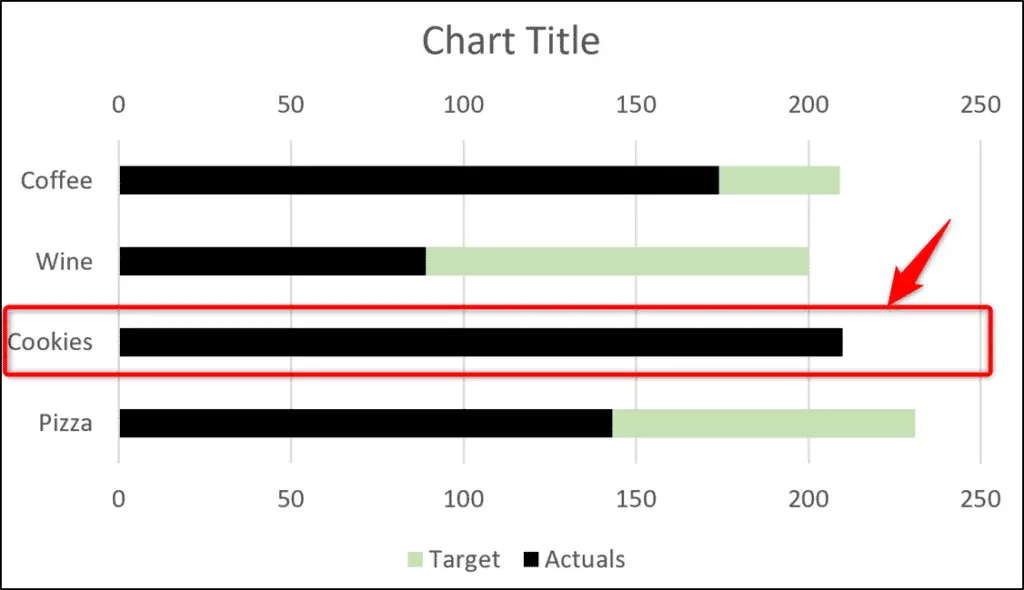
We now need to make the width of the “Target” column wider so that it is always visible. At the moment, when you look at the “Cookies” data, because the “Actuals” value is larger, the “Target” column is not visible.
Click a column in the “Target” series to select it and decrease the Gap Width to what you want to use.
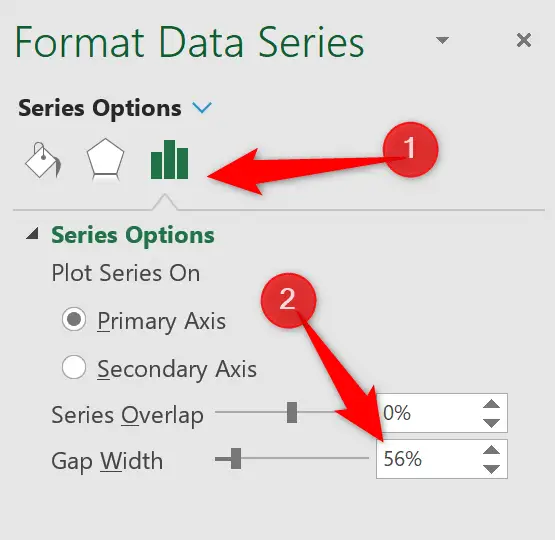
The “Target” column is now visible. This technique was possible because they are on a separate axis.
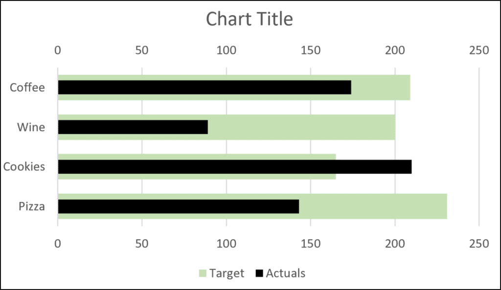
It is time to add some more polish to the chart. We will remove elements that we do not need. For example, the Legend, Chart Title, both axes and the gridlines.
You may not agree with removing all of these elements, so adapt as you see fit.
Then add in some data labels for the “Actuals” column.
Select a column in the “Actuals” data series and click Chart Elements > Data Labels > Outside End.
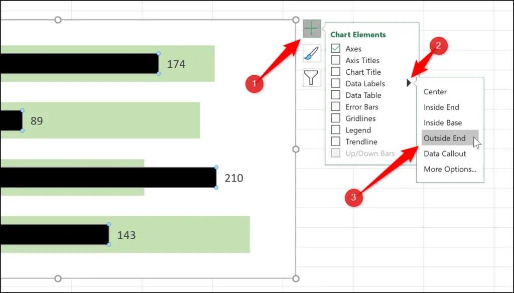
Our bar in bar chart is complete.

A Common Issue to Be careful Of
When you create a bar in bar chart using this technique, be sure that your axes are scaled the same. Especially when they are hidden like in my final bar in bar chart.
For example, in the chart below the two axis are visible and you can see that they are scaled differently making the chart incorrect.
The actual values of “Wine” and “Cookies” should not be exceeding the target values.
This is caused by the actual values being small – maybe it is because it’s the beginning of the reporting period.
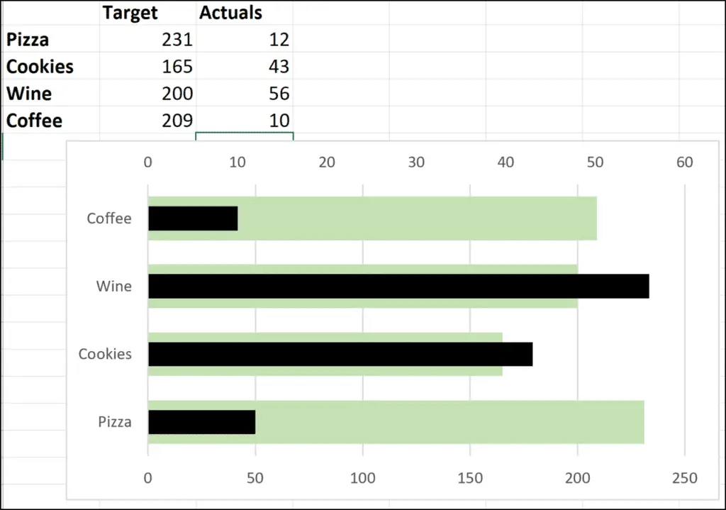
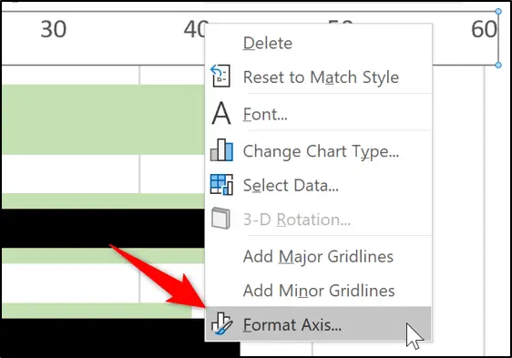
We can perform the following steps for each axis to ensure they are the same. Right-click on the axis and click Format Axis.
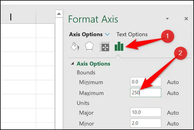
Click Axis Options and enter the max value in the Maximum box. For this chart we can use 250 as a value we can be confident with.
Bar in Bar Chart – Alternative Method
This is a method that was brought to my attention by one of my YouTube subscribers – Wayne Edmondson.
Using this method will ensure that you have no scaling issues – because the actual and target values share the same axis.
Select the range to use and click Insert > Insert Column or Bar Chart > Clustered Bar.
Right-click a data series and click Format Data Series.
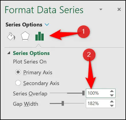
In the Format Series pane, click the Series Options category and enter 100% for the Series Overlap setting.
Click on a column in the “Target” data series to open the Format Data Series pane.
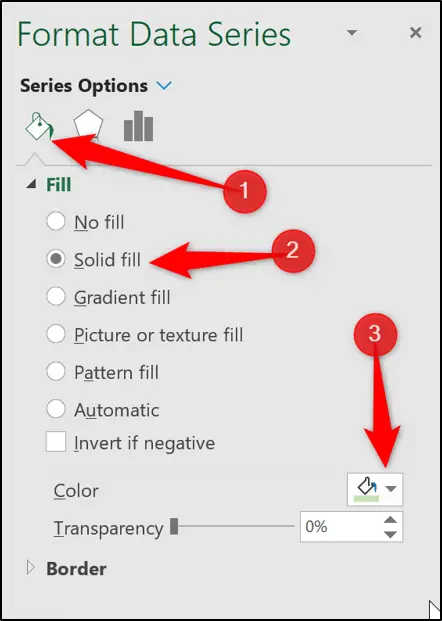
Click Fill & Line > Solid Fill and choose what colour you want to use.
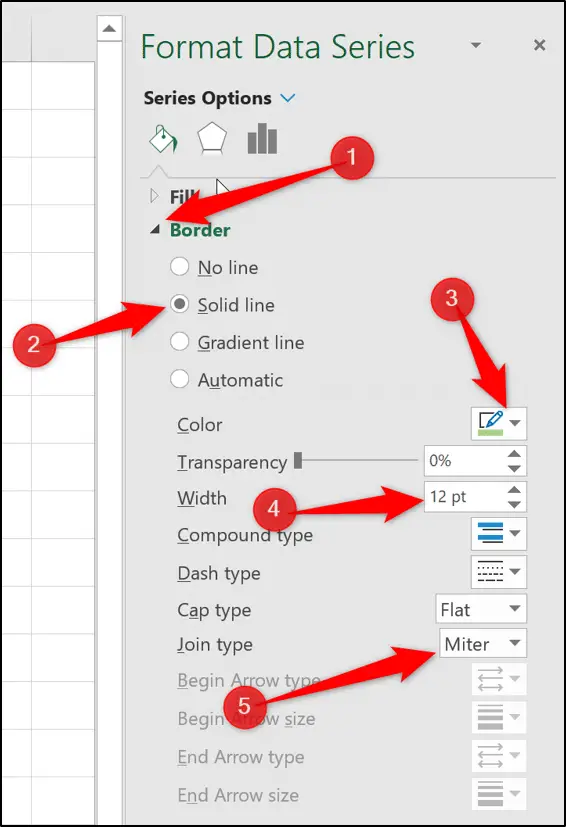
Expand the Border category. Set the border colour to the exact same colour as you did for the fill colour.
Change the border Width to 12 points and the Join Type to Miter (flat edge).
Change the fill colour of the “Actuals” values and add data labels as in the previous method.
The end result looks the same and will ensure that the axis will behave themselves.


Leave a Reply